▲ 150 points
back
38 comments
Thank you: to the person who posted the link to my blog; and to all the people who came and checked it out. I'm glad that my transcription efforts have been of use!
Cheers, Riccardo Mori
Hi, thanks for your work. Regarding: "I’ve listened to this bit many times and I’m pretty sure Tesler says ‘foils’, and I guess he’s using the term in its architecture‐related meaning of “a leaf‐shaped curve formed by the cusping of an arch or circle” — But I welcome any correction from native English speakers."
He surely talks about preparing the "transparency" foils for presenting them using the overhead projectors:
https://en.wikipedia.org/wiki/Transparency_(projection)
"A transparency, also known variously as a viewfoil, foil, or viewgraph"
That's how the presentations were done at that time, using the:
https://en.wikipedia.org/wiki/Overhead_projector
The good side was that you were able to prepare the foils before but then annotate any (i.e. write or draw on it) during the presentation, which had its own dynamic -- it could have been a result of the interaction with your viewers -- like while you were answering some question.
The foils were even used in the very talk you transcribed: https://youtu.be/OW-atKrg0T4?t=1295
Thanks! Maybe it's because I was overwhelmed by the transcription work itself, but while I know this meaning of 'foils', I was totally misled. Tesler was talking about this drawing program and all I did was fixating on geometric shapes, haha. Cheers!
Regarding the foil reference, it’s actually a reference to something that technology has made obsolete. Back then people used to use overhead projectors for presentations, and the sheets of transparent film were called foils. There were sometimes hand drawn with markers, people could have used LisaDraw to print foils. Later on programs like Aldus Persuasion and Microsoft PowerPoint were used, but for a long time their output was printed rather than used directly like most people know today.
Thank you. I'll make the necessary changes to my commentary in the transcription. Cheers!
Another great link if you're interested in Apple's design insights: "Macintosh Human
Interface Guidelines" , from 1995 or so. I keep a copy on my desk at work as it's a great conversation piece and full of fascinating HCI insights.
You can download a PDF here: http://interface.free.fr/Archives/Apple_HIGuidelines.pdf :)
One of my favorite details that seems to be frequently overlooked in modern times is the ellipsis on menu items to indicate that further user input is required (see "The Ellipsis Character in Menus" in Chapter 4). Lots of software follows this pattern, but a surprising amount of software _doesn't_!
The current HIG still says "Use an ellipsis whenever choosing a menu item requires additional input from the user", but doesn't elaborate on this. Even Apple seems to have abandoned their earlier conventions and mostly just resorts to "use an ellipsis if the control will show another window/dialog".
Apple's guidelines used to make it clear that (a) if the only additional input was a simple confirmation, it shouldn't get an ellipsis, and (b) if the whole point of the menuitem/button was to show a window, then it doesn't need 'more input', so it shouldn't get an ellipsis.
Both of these are violated by the Mac's built-in applications in Mac OS X, which is a shame.
Copy&paste from current MacOS HIG: "Use an ellipsis whenever choosing a menu item requires additional input from the user. The ellipsis character (…) means a dialog or separate window will open and prompt the user for additional information or to make a choice."
Maybe you looked at other platform HIG? Can you share examples where the guidelines are violated by MacOS built in applications, please? Not saying it's not happening, just curious.
> The color that is most difficult to distinguish is light blue, which should be avoided for text, thin lines, and small shapes.
In hindsight kind of ironic given how much light blue/blue is used in 'modern' interfaces.
This was also replicated by IBM CUA standard so Microsoft Windows had it from day one, too.
As a Macintosh user since System 7, I cannot be more in love with the old UIs and UX. I really enjoy the pixel era. Certainly, the introduction to OS X took Apple to a different level, but the OS 9 UI for me will be one of the best examples of the epitome of OS. Good in interactions, colors, details, sound feedback. I will always thanks Apple for such work poured on an OS.
This is kind of how I feel about Windows 95. I remember when there was only DOS, and then Windows 3 came out, and then Windows 95 which seemed like the very perfection of UI. Since then it seems to have gone downhill. Not very many true innovations, which is partly why I started experimenting with desktop Linux and finally switched to Mac OS X 10.4, because it felt like the final evolution of the desktop. Nowadays, nothing seems quite ideal, but Win95/98 will always seem like the epitome of desktop UI, the perfect union of form and function. Probably just nostalgia and rose colored glasses though in all honesty.
I think it’s not just nostalgia. Windows 95 was a huge step for MS and introduced most of the UI elements that we are still using now. Since then I have trouble seeing any fundamental improvements in newer Windows versions. I’d be happy to go back to the UI of 95 or XP compared to the latest Windows 10 stuff. I just don’t it really got any better. Just slower.
Windows 95 was a major step into OSes too. I remember how well done the UI was. It became silly in 98 and then on XP with crazy design styles that. I don't know if the original design team left Middle Earth, but in two years they've experimented too much and Windows became normless while Apple maintained guidelines with better hand.
I do like that some Windows programs are now converting menus into searchable hierarchies, e.g. Visual Studio and VS Code. But those are just programs, and they're only power-user programs. Searchable grouped functions are a genuine innovation on top of hierarchical menus. The "Start Menu" improved on that front and it is generally good.
I think the problem now is that some programs make improvements but the OS is stagnating. With Windows 95 the OS provided all the widgets like toolbars, menus and help system so most applications were pretty consistent. The first break was when Office introduced the ribbon but everybody else was forced to code their own ribbon because it wasn't integrated in the OS. Now with UWP and Win32 there is no consistency anymore. Searchable menus could easily have been integrated as standard for all apps if anybody had cared.
Same thing for rearrangeable tabs with close buttons. I think Firefox introduced that concept (maybe it was Chrome), but it never got an official API, either on Mac OS X or Windows, which is strange because it's been such a fundamental part of certain programs for 15-20 years now. Lately macOS kind of has this, by allowing automatic grouping of documents for you, but it just feels hacked on compared to giving us this as an actual GUI component.
I have a soft spot for System 6, because it is the epitome of the classic, classic version of Mac OS--black and white, minimal, but with all the essential elements of a modern GUI, before all sorts of new complexities started to be added in in System 8 through OS 9.
Yes, when it comes to icons, pictures, non-trivial logos etc. the "pixel" style has always been the most effective way of coming up with something that will look appealing even with minimal effort. Even on modern screens, a properly-upscaled, pixel-based icon usually looks a lot better than the symbolic, vector-based look you most often see today, while taking a lot less time and effort to create. You can see this very well on other user interfaces from the 1980s and 1990s too, it's not exclusive to the Mac.
(And there's a sensible reason for this, too - the "pixel art" style is unique in letting you set a uniform ceiling on high-spatial-frequency content and subtle color changes within a picture, while preserving unbounded choice within these constraints.)
Right, the low fidelity of 32x32pixel icons means they are easy to "read" and make sense of. Conversely, SGI's IRIX OS had vector icons which made them extremely varied and IMO they sometimes required a lot of effort to understand. Check this screenshot[0] to get an idea of what I mean. They are not immediately obvious due to their high level of detail.
That said, I found it super cool that the icons can scale, right in the file explorer (using the "scroll wheel" type thing on the left side of the window)!! :)
[0] https://software.majix.org/irix/screenshots/screen.5.big.jpg
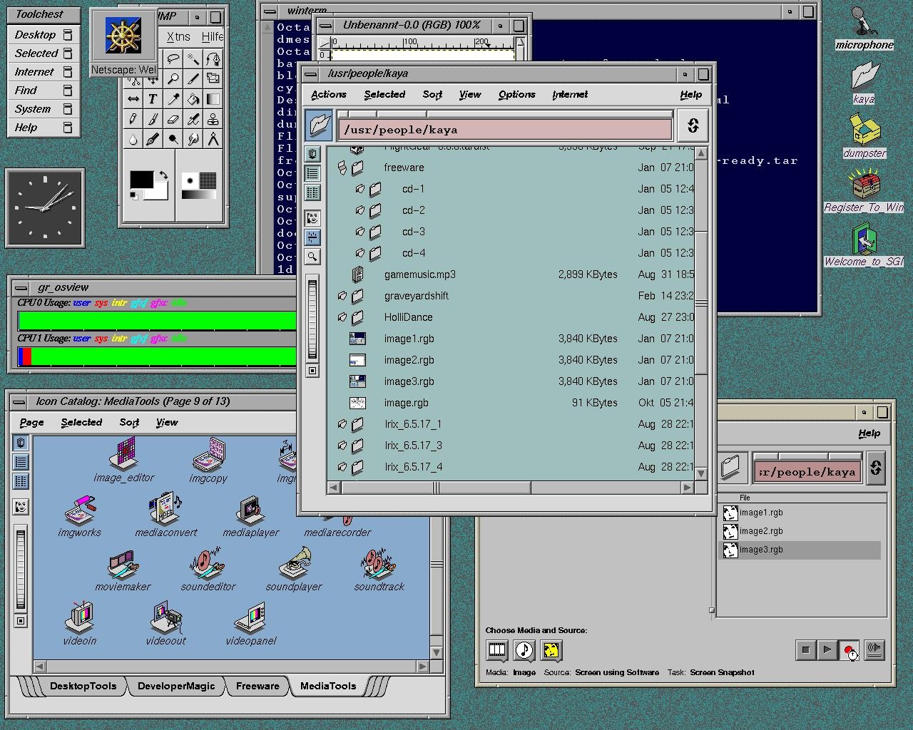
I never had the chance to use SGI's IRIX OS. I was teenager and the pricess where so prohibitive for such workstations. I had the luck to start a job where the owner had 15 Macs, among them, they throw me all the older models so I learnt that way.
I've been user of Microsoft, IBM's OS/Warp too. I liked a lot Windows 3.1 and the first Windows 95. They showed good level of work, not only in the guts of the OS but also the GUI. But those styles faded once I get back into the mac, with their icon styles, you can change icons on the fly it was so easy. It was part of OS 7, 8, 9.
If you’re interested in Apple UX design, check out this blog [0] from Apple’s first HCI engineer.
This one [1] is one of my favorites, about the MacOS dock when it was first released.
I still despise the Dock. I even figured out how to hack it to make it invisible so I could use DragThing instead. Over time those hacks stopped working and DragThing ceased to exist (or at least I think it did) so now I just live with the stupid Dock. Thanks Apple.
Dock does a lot more than just the part you can see at the bottom of the screen, so you're not going to be able to truly get rid of it without breaking pretty much everything to do with Spaces and Launchpad along with it. Perhaps you could set it to auto-hide and only show after an extremely long delay?
That's exactly my point. Apple wove so much functionality into the Dock that it's now effectively impossible to remove it. And I may be weird, but Spaces and Launchpad are two of the things I immediately turn off, along with Mission Control, Dashboard, Expose, etc. because all of the above consume needless RAM or just get in my way.
If you don’t like those things, then I don’t see why you can’t just prevent it from launching?
Complementary to Larry Tesler's talk, see "Busy Being Born" by Andy Hertzfeld on Bill Atkinson's work during this period (some of the polaroids are in the annotated transcript as well):
https://www.folklore.org/StoryView.py?project=Macintosh&stor...
(Something I always found interesting about this, is Bill Atkinson's suggestion that some of the window related UI was already in place before the PARC visit. Having a look at the polaroids in question, seeing Smalltalk may have been even a distraction, at least in terms of the design language.)
Can I just say that the typography of this blog is impeccable?
There’s a story (Prometheus myth) that Steve Jobs and the Mac team copied the human graphical interface idea from Xerox.
A fascinating read about it here:
Well, there's always that quote from Bill Gates when Jobs accused MS of stealing Apple's GUI design:
“Well, Steve [Jobs]… I think it’s more like we both had this rich neighbour named Xerox and I broke into his house to steal the TV set and found out that you had already stolen it.” - Bill Gates
Source: https://www.goodreads.com/quotes/824084-well-steve-jobs-i-th...
I always found it weird that Gates characterized it as Apple "stealing" the TV set. Xerox gave the TV set away! They had made a pre-IPO investment in Apple and in exchange the executives were happy to show Apple what they were working on (to the dismay of the actual researchers)
Not a story it's a fact of history. Xerox PARC is the lab where Xerox invented several parts of what defined computers up to today (the window oriented gui with mouse, the laser printer, ethernet,...They're even credited for invented the wysiwyg text editor, so basically Word), inventions that were then completely ignored by Xerox while the other companies around jumped on them. Bill Gates is much more open about how the Microsoft and Apple gui was copied / stolen from Xerox, but then again he and Microsoft never had the "we are the first / we invented it" thing that is so important to Apple mythos.
Reading about Xerox parc is super weird though because it feels like the place was handled the way you expect a publicly funded place to be, being so open to share their finding with competitors and all. Truly a golden era, today those are much more closed, even places like MS Research.
So the reality is that they copied it, it just didn't happen in some magical visit to wonderland.
If you looked the Mac OS review of arstechnica you can see how detail of apple and ars technica on the user interfaces.
Here's what a lot of early Mac OS design actually looked like (System 1 through System 9):
Video of the lecture: https://www.youtube.com/watch?v=OW-atKrg0T4
Not all is great when it comes to Apple’s UX & UI. Interesting read:
https://hackernoon.com/dear-apple-please-fix-notifications-6...