▲ 98 points
back
38 comments
Interesting that the article doesn't mention Greek lowercase sigma which has similar rules:
> uppercase Σ, lowercase σ, lowercase in word-final position ς
The interesting part: "The long s survives in elongated form, with an italic-styled curled descender, as the integral symbol ∫ used in calculus."
The notation for the indefinite integral was introduced by Gottfried Wilhelm Leibniz in 1675 (Burton 1988, p. 359; Leibniz 1899, p. 154). He adapted the integral symbol, ∫, from the letter ſ (long s), standing for summa (written as ſumma; Latin for "sum" or "total").
This is very interesting:https://stronglang.wordpress.com/2015/04/03/google-ngrams-vs...
The word "fuck" was used a lot in the 1600s according to OCR.
Well the OCR were humans :) Before Google produced the Waymo (or Maps?) datasets with recaptcha, it was book digitalization. I remember always being frustrated when I had to enter the long as as f to make the captcha go away...
That's true. When the recaptcha was two words, one of it was the control word (which would make you fail the captcha if wrong) and the other was the word you were actually OCR'ing. I would always enter the control word correctly and put "fuck" as the other word. I would get it right 90% of the time :)
Heh, I just modified my keyboard layout to add the long s as the alt gr output for s. Microsoft Keyboard Layout Creator was pretty handy (There were other keys I customised to justify creating my own layout variant)
[0] https://support.microsoft.com/en-us/help/823010/the-microsof...
[1] https://www.microsoft.com/en-us/download/details.aspx?id=223...
You can actually use the google ngrams data set to determine that the long s was eliminated from print over a 25 year period roughly from 1795 to 1820.
If you'd like to be able to use the long S in Emacs, there's a minor mode for that: https://github.com/aaron-em/long-s-mode.el
It's an older one and I apparently haven't put it on MELPA yet. I can, if there's interest.
"Copyright (c) 2013 Aaron Miller. All rights reverſed. ſhare and Enjoy!" Heh!
I'm not sure bulking up melpa is worth it for the infinitesimal number of people who would find it useful.
Tangentially I really wish letters eth and thorn had not disappeared. They were certainly better than what we've got now, the 'th' digraph for both.
In English the voiced/unvoiced distinction stopped mattering so merger of eth and thorn was warranted. A digraph is a sad compromise, but given sh/ch digraphs its now just a given standard in the language's orthography. It might be fun to use better letters for all of English's digraphs, but that ship has probably sailed at this point.
The long S is also problematic for OCR: https://books.google.com/ngrams/graph?content=cafe&year_star...
(Google ngram viewer is pulling the word "case" with a long S from the many legal documents in its corpus)
On a related note, I have been looking for good references on cursive writing. While there are many references for cursive writing popular in the US such as D'Nealian, Zaner-Bloser, etc. there aren't many as many references for joined-up writing popular in the UK. I was looking for something where the joined-up style resembles printscript as much as possible. Here are a few resources I found during my search for anyone interested in British-style joined-up handwriting:
- https://www.cursivewriting.org/joined-cursive-fonts.html
Although the second link is the more recent website, I like the fonts presented in the first link.
In ancient Egyptian hieroglyphs, the phonetic sign for the S sound was a vertical bar bent around at its top end:
https://en.wikipedia.org/wiki/Transliteration_of_Ancient_Egy...
Apparently it's officially called "folded cloth", U+132F4.
I wonder if there's an actual lineage here, or if it's just a coincidence that the S sound is represented as a curved vertical bar across millennia.
I’ve wondered if it’s shaped after a snake as the sound matches up (“sssssss”).
Perhapsss sssurprisssingly, the sssnake letter is “N”.
Faſcinating!
(backſ-away-ſlowly)
Should be "backs" because long-s isn't used if it's the end of the word.
> Before a hyphen at the end of the line a long ſ must always be used, for example Shaftſ-bury.
That's when hyphenating a word, not between different words linked by hyphens.
That's exactly what a hyphenated word is.
No. "Hyphenating a word" here means when a whole word is split by a hyphen to continue on the next line of a justified column of text. In that case only, a long s is used before the hyphen.
The hyphen is not at the end of the line. Shaftſ-
bury is just Shaftſbury with a hyphenated line break.
The example of "Paradise loft" written as "Paradife loft" reminds me of the Norwegian newspaper Aftenposten's logo looks like Aftenpoften
The Philadelphia Inquirer recently updated their blackletter logo in part I think because I looked more like a J.
https://www.garciamedia.com/blog/its-a-refreshed-logo-for-th...
This is ſuch a ſilly diſcusſion
Shouldn't it be "diſcuſsion"? The ß character derives from ſs, after all.
This whole topic is a ſlippery ſlope
ſomeone pleaſe ſtop me
These days you usually become familiar with that letter through looking at title pages for old books on Wikipedia.
The still use it on the street signs hereabouts, writing "-straſze" instead of "-straße".
Interesting, where is that?
Wikipedia has an example of a street sign with "ſs": https://en.wikipedia.org/wiki/File:Waldstra%C3%9FePirna.JPG

And of course there are the street signs in Berlin which use a very weird ß, but it's still an ß as opposed to a "ſz" combination: https://en.wikipedia.org/wiki/File:Berliner_Stra%C3%9Fe.JPG

I absolutely love the typographical choices used for Berlin's street signs. There are multiple variants but I'm talking about the posted one. It also preserves the old tz-ligature[0], the vertical descender on lower-case Y[1], as well as both the ch- and the ck-ligature which (being an antiqua font) are mostly realized in terms of careful kerning [2, 3, 4].
The font is both pleasing, readable, breathable, and has these nods to Germanic typographical heritage. It's really lovely. Among my favorite details pertaining to living in Berlin.
[0] https://www.xn--untergrund-blttle-2qb.ch/fotos/Strassenschil...
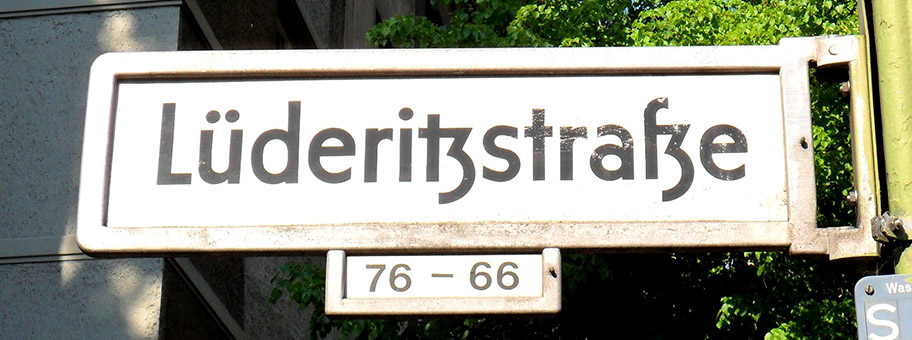
[1] https://live.staticflickr.com/3730/9668177465_bde765c591_h.j...

[2] https://fhxb-museum.de/xmap/media/S16/T1815/image/fhxb_jh_k0...

[3] https://upload.wikimedia.org/wikipedia/commons/thumb/d/d8/M%...

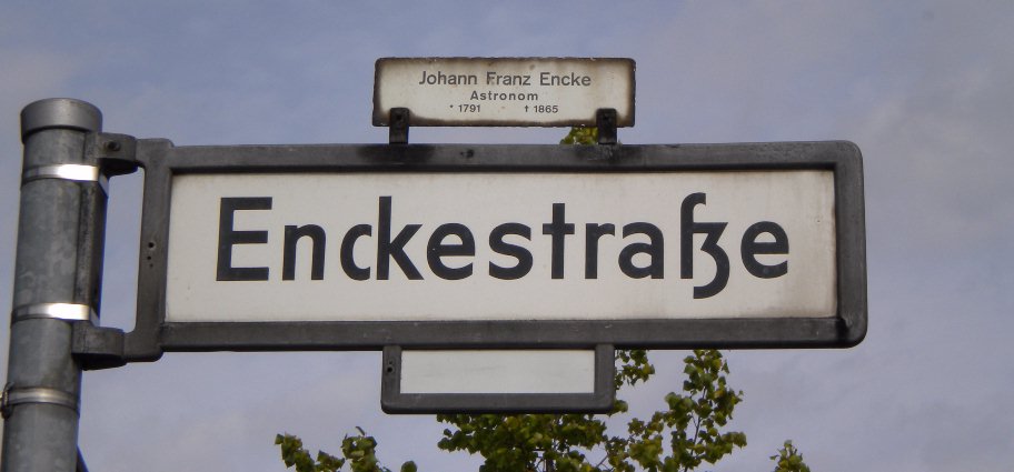
The berlin "ſz" has a fascinating history of letters, typesetting, and economics!
First off, it's strange that the German letter "ß", a ligature of two "S" forms, is named "Eszett", which is the letters "S" and "Z". This is because way back in Middle German, "sz" was the more common form. [0]
When moveable type was invented, Italian and Latin (and sometimes English) needed the "ſs" ligature, while only German needed the "ſz" ligature. Thus most typefaces only included the "ſs", so when printers needed to print German, they would substitute the readily available "ſs" for "ſz" rather than buy a new font. (This was further complicated by the dispute within Germany about whether to use Fraktur or Antiqua typefaces [1])
This practical economic decision led to the "ſs" ligature becoming standardized, turning into the modern letter "ß", but still called "Eszett"!
Berlin street signs are fascinating as they (alone?) maintain the old-school "correct" "ſz" form.
Most Germans seem to never have noticed that the name of "ß" is wrong. But similarly, English rarely notice that "W" is also named wrong--it is formed of a double-V not a double-U!
- [0] https://en.wikipedia.org/wiki/%C3%9F#Origin - [1] https://en.wikipedia.org/wiki/Antiqua%E2%80%93Fraktur_disput...
The Berlin ſʒ is indeed what parent was referring to....unless he meant Bonn, where a very similar font is used. Would be interesting to know if a font like this is used elsewhere too.
I was momentarily confused by these when I saw them in some old journal articles on PubMed. There's a load if you search a really generic term and sort oldest to newest.
I had to read the caption of the poster in order to see that it was "Paradise Lost" and not "Paradise Loft" ...
I first came into contact with the long s while reading (IIRC) Antoine de Lavoisier's memoirs (or papers?) on the nature of diamond. It was very unnerving to read, as I couldn't see the difference with an "f" before enquiring more about it, and reading the wikipedia article.
I couldn't find the exact reference, but the book was along the lines of that one (French): https://books.google.fr/books?id=yr3OAAAAMAAJ&pg=PA22