▲ 234 points
back
118 comments
For a fun experiment, try Google finance with the Japanese language tag (https://www.google.com/finance/?hl=ja). Even knowing about the switched colors, it still fools my eyes. Goes to show how deeply ingrained the usual red/green assignment is!
Reminds me of the time I heard from someone much older than me that Democrats and Republicans switched from being red or blue almost every year until 2000 when the election results were so uncertain that people got used to seeing red=Republican and blue=Democrat for weeks and the color scheme just ended up becoming permanent.
As a (younger) politics junkie I was shocked even though it makes total sense and I've always kinda felt they should've been switched.
Oh wow, that greatly varies from locales to locales. Not only the color can be swapped depending on the locale, but the specific color can also change. For example the Korean locale (hl=ko) uses red for up (same to Japanese) but uses blue in place of red for down. Both languages have a single native word for blue-or-green or "grue" so either should work in principle, but I have no idea why Korean specifically uses blue. In my brief check there is only one more locale (Khmer, hl=km) where blue is used in place of green (for up in this case).
I know Japan likes red, but I'm surprised that the TSE uses green for a negative/falling connotation. That's not a Japanese cultural thing generally, AFAIK.
Is this just a historical path-dependent thing — e.g. stock-exchange trading floors traditionally all buying their sign boards from some specialty company that produced boards specialized to have exactly two "color channels" — red and green — and then, when the TSE got theirs, it was all they could do to just wire the color channels up backwards?
(I guess there are a few types of meters that always use red as high and green as low — e.g. pressure gauges. But that's because red in those cases means danger. A high stock value isn't dangerous!)
Wait till /r/wallstreetbets finds out about this!
"I hope 'plunging' means 'up,' and '75' means '200'"
- Homer Simpson on stocks
Thanks for the share - Makes me feel like my investment portfolio is rocketing now!
With the market the way it's been going these days, I think I prefer getting fooled!
It is kinda funny to see the trajectories that the different companies pick.
Samsung is the only one that puts a little negative blip at the end of theirs.
Apple shows a little blip at the beginning, followed by what appears to be endless, inevitable increase.
From 2013-2015, Microsoft put stagnation toward the end of theirs, but then a tiny optimistic increasing trend at the end. However, starting in 2017 they decided theirs should look more like Apple's.
Google is always optimistic in the long run but puts some bumps in the middle.
Facebook minimally fulfills the requirement to draw a graph.
Samsung seems to put a positive uptick at the end of their chart decreasing emoji.
Also noticed Google and Samsung's ice cube emojis are melting. And Samsung seems to generally be on the generous side of their containers. For example, their salt shaker emoji is mostly full as well as the beer emojis. One of the exceptions is their wine glass emoji.
I don't know why I looked into this at all.
Also neat is what date the calendar emojis show for each platform: https://emojipedia.org/calendar/
> The date shown is July 17. This date was first used by Apple as a reference to when iCal for Mac premiered at MacWorld Expo in 2002.
This doesn't seem to have a history, but a fun page to waste some time on none the less: https://unicode.org/emoji/charts/full-emoji-list.html#1f4b9
Eh, since COVID, graphs that are going down are interpreted as positive.
It starts with knowing why it was originally pronounced "eh-mohjee", and not "ee-mojee".
The better question, then, if you really want to learn about culture, is why red is a good color in Japanese culture.
I'll just tell you: Red is related to sun symbolizm in Shinto, it scares away evil spirits of 'the dark'. And the Japanese emporer (before McArthur said otherwise) was a sun god (descended from Amaterasu). Some Japanese still intrinsictly believe this. This is represented in the Japanese 'asahi' emperial flag with the red circle and red lines, and in the current national flag with the red circle (white is a symbol of purity in Shinto, as well, btw). Torii gates are also red, etc etc.
I had to look this up, as I (wrongly) thought the etymology was derived from the English "emoticon", but it's not, it is a purely Japanese word.
https://www.sciencefriday.com/articles/the-origin-of-the-wor...
So, yes, you are absolutely right, technically I have been mispronouncing it for almost two decades. I can't stop now though, because everyone else outside Japan is also doing the same.
The Japanese language actually does have an idiom for "in the red". It's written as 赤字, which literally means "red letter" or "red text". The opposite is 黒字, or "black letter" / "black text" which is equivalent to English's "in the black".
I guess this just doesn't carry over into the charts used in the financial sector?
This is a bit tangential, but I sometimes wish there were a word for the mistake of thinking a convention represents a fundamental property of the thing represented.
Other examples that come to mind:
1. Maps that aren't oriented with north on top
2. U.S. electrical outlets that are "upside-down"
I'm sure there are others, but those are the two that jump to mind.
Funny you mention the outlets. They're actually safer "upside down" because if they get loose and something falls on top, it'll just hit the ground pin instead of possibly creating a circuit across the hot and neutral.
When I see that emoji I think of a sales chart, not stocks. I feel like the sales charts are usually red, even when increasing - presumably becauseit stands out.
That's because you have a functioning brain. To most people the Emojii set is a dictionary of displayed objects. This object is a chart (obviously) and what do charts do? They represent data, not all charts represent the data of stocks. Even less represent the data of money itself!
Weird that people could see interest in why a chart might have a red line even if it goes up? Like, do they not know charts exist outside stock markets?
I'm red-green colorblind, and for this reason was never allowed in accounting at work. I kid, but it sure does surprise me that so much of the world uses red/green to visualize! Passive-aggressive fun fact: roughly 8% of men have some colorblindness.
I once worked for a telecom company that hired a red-green color blind person to splice 9/125 singlemode fiber, and do DC power work. Needless to say it was not a good match.
> roughly 8% of men have some colorblindness
8% of Northern European males, but this includes all types of color vision deficiency, even those who have limited, but still functional, color vision.
8% seems shockingly high, if that's true then it's also shocking how little effort seems to be made to compensate for colorblindness.
Why aren't Emojis presented differently depending on type of colorblindness for example?
Funnily enough, the Japanese word for "(business) deficit" is literally "red letters" (赤字): https://en.wiktionary.org/wiki/%E8%B5%A4%E5%AD%97
(Wiktionary says it was borrowed from English - no idea if it's true.)
Interesting! Similarly, in English we would say that a business was "in the red" if its expenditures exceeded its income. (Or something like that. It's a colloquialism, so it doesn't really have a specific technical meaning.)
Fun fact: many western day traders flip the colors. On actual charts, regardless of emojis. So they intentionally turn up into red and down into green.
It has nothing to do with color culture, rather that green is a buy signal (buy the dip) and red is a sell signal (sell at euphoria). This is of course a simplification of trading, but short term traders make money no matter the price movement, or at least try to.
Random question: Why are there so many emoji "implementations"? I understand copyright, but is it really cheaper/easier/preferable for all these different companies to design their own emojis?
For the same reason that there are many fonts. Unicode only defines codepoints, like "UPSIDE-DOWN FACE U+1F643", similar to how it only defines "U+0041 LATIN CAPITAL A".
I for one believe it was a very stupid idea to standardize emoji, but here we are.
Interestingly, "Chart Increasing with Yen" is almost universally green: https://emojipedia.org/chart-increasing-with-yen/
That's not interesting.
Money chart is a subset of Chart set. Charts don't have a pre-defined colour for rising data points...
Chinese stock markets also use the color convention that green means down and red means up. Example pictures (notice the negative signs): https://www.china-briefing.com/news/wp-content/uploads/2014/... ; https://cdn.i-scmp.com/sites/default/files/d8/images/methode... ; https://imagecloud.thepaper.cn/thepaper/image/154/50/3.jpg
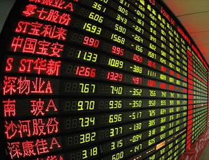
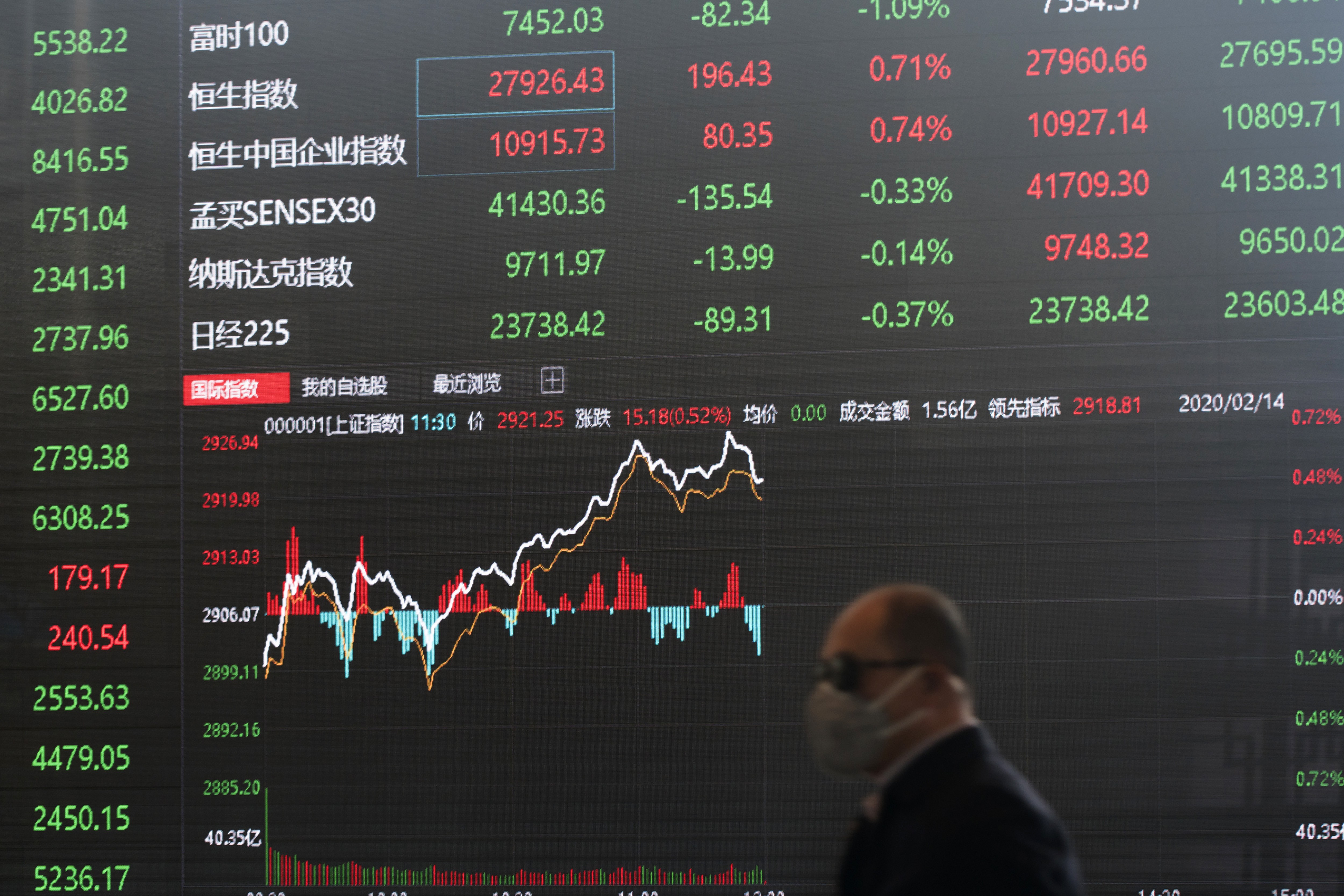
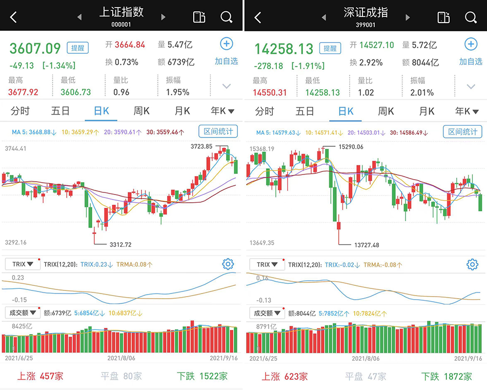
I'm not sure which country/culture first adopted this convention - China, Japan, etc.
maybe i am the only one who did see the cultural meanings as obvious but i was missing this information:
reasoning western culture:
blood > death > danger > warning
reasoning in eastern culture:
fire > energy > vitality > growth
Well the “chart decreasing” emoji is blue. So that whole thing about Japanese stock exchange is wrong…
Chart-decreasing is mostly blue, but sometimes red and orange. Google had green for a while, but changed it.[1]
This title hurt my brain.
I'm intrigued about when the terms smileys and emoticons were replaced by emojis. Also I just read that emoji is not related to emoticons but ~eh-moji, a Japanese term. https://www.sciencefriday.com/articles/the-origin-of-the-wor....
Are there localized "fonts" for emoji? i.e. Could Apple display the chart in green on iPhones with western system languages, and red on iPhones with Japanese set as the language? Surely this is not the only example where different cultures conceptualize the concepts behind emoji differently. Another (potentially touchy) example would be automatically adding / removing a hijab for emoji featuring women in Arabic iPhones.
> Meanwhile, green is used to represent decreases in stock value.
Okay. Now explain why the "chart decreasing" emoji is blue instead of green.
Ironically, the "chart increasing with yen" this was based off of (which was later accepted into Unicode itself) is green in my device's emoji set, as well as the vast majority of other implementations. You would think that one would be the one where the Japenese meaning of the colors was used for sure.
But their traffic lights are red, being the traditional "STOP", or caution, etc...why would that be chosen to be applied to something increasing?
And apparently chart-decreasing is blue, again opposite correlation to use in traffic lights, meaning "go"
Just use the Japan map emoji as shown next to the Japan headline in the article. The image of Japan country looks like the increasing chart enough and is green.
TL;DR: Because emojis are of Japanese origin and (east)asian countries use red for profit and green for loss.
I always assumed that green was good and red was bad given that stoplights are relatively universal.
If you like shapes and colors of charts, you may like the mobile game "The Firm"
Similar reason why Jenkins CI by default uses blue to indicate success.
Figured they were only familiar with burndown charts.
"According to our latest quarterly thing, Kruger Industrial Smoothing is heading into the red. Or the black, or whatever the bad one is."
It's because they're tracking crypto prices.