▲ 546 points
back
217 comments
(disclaimer: lead brand manager, been at the table of a lot of the meetings where these logo changes happen.)
There's a few different reasons (especially depending on the company) why that these happen, but I personally think it boils down to two unintuitive quasi-psychological reasons.
- When suits are fumbling around looking for a new shiny project that'll give them a sense of "legacy" and their fingerpints all over (that won't affect immediate profits), somewhere in marketing and brand is usually the first place they'll grab. If wins, fantastic, they've secured their legacy both in a career-spanning sense and at the company itself with a bonus. If it fails disastrously, easy enough to quietly switch back to the old and to save face by tackling a different project.
- Sort of relatedly, a lot of marketing suits hate feeling "left out" of trends; it's something I loathe about the industry, the hyper-focus and optimization of being at the crest of new trends (when arguably they're usually shittier than the previous ones). Oftentimes their entire salary / sense of purpose of being at the job is tied into with presenting the latest and greatest, and insecure designers will be too happy to be enablers.
(My opinion may be a minority of the industry itself as if it were me, we'd be back to 90's era logos for the sheer zany quality.)
The sad part is, I have literally lost brands. Just entirely been unsure what I used to buy, because I buy based upon look, not just on product name.
EG, I buy battered fish in a blue box, the box disappeared from my main grocery store. When I went to my less visited store, it was gone there too. Literally, I just picked a random replacement brand.
Another thing which gets me, is marketers think everyone buys things weekly. And I once noticed a product I was hunting for with "New look!" on the box, but if was the last of the "New look!" boxes, the ones behind tem were missing the pronouncement.
I'm buying fish sticks here, and I do so once every 6 months, and throw a bunch of boxes in my deep freeze.
I'm not tied into what "exciting change" some yahoo thinks their product is going through, nothing is exciting about the food I buy, I just want fish sticks.
The box could remain the same for 100 years, and I'd buy the same thing, as long as the taste and quality inside didn't diminish.
UI designers ruined Gnome, ruined my fish sticks, ruination upon us all due to UI designers.
This is the right answer. Empirically, continuity of brand assets actually drives higher brand recognition and awareness/shoppability advantage over time, particularly for consumer goods. Look through the disastrous Tropicana branding change example for how wrong can changing familiar assets go.
However, the marketing teams get bored of their branding and ads way way before consumers do - after all each consumer see a big brand in a branding context maybe half a dozen to a dozen times a month for a few seconds at a time in advertising or stores. The marketing teams see it every day every hour :-)
So they naturally desire for change - exacerbated by the fact that the "experts" in marketing agencies or relevant in house functions have no incentive to tell them different as they make money off of the change :-)
It is absolutely disgusting how much gets done in this world simply because someone needed to stroke their ego. Legacies, bonuses... pah. Pathetic how predictably selfish we humans really are.
What really strikes me is the lack of customer centricity in all this. Do they want the change? Do they think the existing look is outdated? Do they like the old look? Pah. Who cares! I have a legacy to cement and a bonus to secure!
(Besides the usual MBA word-vomit mumbo jumbo like 'modern utility', but we all know those are just made up excuses)
Maybe a brand should just be... a brand. A brand isn't your friend, it isn't human, it isn't alive, and it most certainly only exists to take your money and put it in their account -- and, in tech, more often than not through some rent-seeking subscription model because nobody likes us actually owning anything anymore.
It's also fun, easy and exceptionally easy to spend a precise budgetary on a branding exercise.
Marketing these days is full of technical details. Digital campaign statistics. CRM. Automation. Tiny optimisations, analytics and such.
Branding lets everyone be involved. Everyone can have a say. A logo change rarely succeeds or fails. You don't have to know anything to make decisions or sound smart. Everyone notices it. Crusty old board members notice, and might comment on the work. Etc.
It's high visibility, low effort, low stress, low bar work.
I'm not implying that great branding doesn't exist. Most of the examples here though... they just changed fonts to whatever is most fashionable now.
The most perfect example of this was when Marissa Meyer took over as CEO of Yahoo and "rolled up her sleeves" and worked with a few designers over a weekend to create a new Yahoo logo. It turned out the new logo was the old one, without serifs and more rounded and uniform.
While I totally agree that logos tend to be changed far too early and too often, at some point the logos do start to look outdated, either because the company evolves or because the world is moving.
For example, the quirky eBay logo was a great fit for a startup during the dot com boom, but the way typical websites look changed dramatically since then and the company became much bigger and professional.
At some point, a logo that doesn't get updated does start screaming "this is a company stuck in a time several decades ago".
> (disclaimer: lead brand manager, been at the table of a lot of the meetings where these logo changes happen.)
This is not a disclaimer. This is, in fact, the opposite of a disclaimer. It is a "claimer", if you will, claiming experience and authority on the topic.
A disclaimer is when you state a reason why people might want to discount your opinion, usually due to a conflict of interest. E.g., "I work at Revolut."
This probably is the reason for why they go down the path of changing the logos.
But why they look similar is because, in the past logo drafts used to be hand-drawn by artists and now its being done by digital artists who first start with available library of fonts.
I fail to see how this explains anything about why brands change their main logo to the same dull style.
The article is confused about the difference between a logo and a word mark, which is what they are showing. Big brands are super pedantic about how and where logo marks and word marks are used. You shouldn't be seeing these word marks in contexts that are not already dripping in branding for the company.
Look at the Pinterest Brand guidelines (https://business.pinterest.com/en-au/brand-guidelines/) and you well find them saying: "Only use the Pinterest badge (please don’t use our word mark)". The Pinterest badge is the exact same stylised letter P from the old wordmark. So, almost everywhere you encounter a Pinterest logo it will be the stylised graphic. They can do that because enough people recognise the brand that they can drop the "interest".
The Facebook logo is an even weirder example because they are comparing the old Facebook app word mark with the newer Facebook-the-company word mark. That logo was specifically designed to look different from the app. Now that Facebook is now Meta, that uppercase logo has been retired.
Microsoft, Facebook, Pinterest, Spotify and Airbnb all have stylised logo marks. eBay and Google use word marks, but are brightly coloured and immediately recognisable 99% of the time they are seen.
These are just the word marks, not the full logos.
I mocked up a comparison of the logos (Microsoft/Airbnb/Spotify/Pinterest rarely use their word marks without the accompanying icon) and they start to retain a _little_ more personality, at least for the tech comparison.
It still seems fair to say they're more bland than past iterations, though. The theme is ”[optional icon] + sans serif word mark”, and it's a good example of “small m minimalism” — a kind of unthinking collective march toward an absence of detail — touched on by The Cultural Tutor in this thread:
https://twitter.com/culturaltutor/status/1538211892707086338
> Perhaps minimalist design is so prevalent because we no longer have anything to say.
> You don't need me to explain what the Gothic cathedral says, for example.
> But the skyscraper? It doesn't say anything, really. It's just... there.
> And suddenly everything, everywhere starts to look the same.
> Absolute neutrality. No detail. No identity.
> What does that say about us?
IMHO the simplest explanation is that style is cyclical, and we've entered into a minimalist, almost brutalist, period and these brands are simply skating to where the puck is.
Will this design trend last? Probably not but doing a rebrand to freshen things up every few years is cheap enough, while the value in being "current" is very much worth it.
A lot of those logos looked old fashioned and almost early 2000s in comparison, which tech forward folks probably don't care about, but it's subtly picked up by the average consumer.
You'll notice this even for companies that haven't changed their brand in ages like Apple. All of Apple's branding and presentation style has changed in similar ways over the past few years.
It's the "tyranny of the minimalist" in my opinion. And it's not just fonts - it's app design, housing and architecture, retail, etc. The sterile, uncluttered-to-the-max ethos has simply infected all aspects of design, even to the point of obvious negative impacts on usability. Not sure if I'd say "Apple started it", but they were certainly on the forefront.
I read an article recently (think it was on HN) about how, not too long ago, wealth and status was displayed with impossibly intricate designs - think the Belle Époque or Victorian designs. Now it's all expanses of black and white. I joke if I see another black-and-white "modern farmhouse" go up in my town I may just throw up on their driveway.
All those fashion brands changed their logos around 2018, with the exception of YSL back in 2012.
In 2012, Hedi Slimane took over the helm of YSL, notorious for the minimalist brand change dropping the Yves from Saint Laurent, but also revitalizing the brand. In 2018, Hedi Slimane became C.D. Of Celine, which has always been touted for minimalism, and made the already minimalist brand even more minimalist by dropping the accented e. There is a mixture of independent fashion brands there, but the majority of the luxury fashion market has been bought up by LVMH and Kering. Those parent companies create a network and platform where brands cross pollinate, in the same way YC serves as an exchange of ideas between SF style startups. In practice, this means pressuring subsidiaries to follow the model that has worked for other brands, within and outside the family. Checkout dietprada on Instagram where they call out plagiarism commonplace in the fashion industry.
My theory is that brand designers who work in tech are influenced by fashion and general product design, which follows apparel. First, trend-setting luxury brands have expanded ready to wear lines and more generally became more accessible, rather than something reserved for the ultra elite socialites. This means more exposure, familiarity. Second, designers make significantly more money than in decades prior. Following in the footsteps of Google, companies found that better design leads to more money. In prior decades, UI/UX designers didn’t exist. The profession matured relatively fast compared to the head start software engineering had. I remember the HCD ( human centered design ) department used to be really in the weeds about the science of ergonomics, and the role UI/UX barely existed. Then the other class of UI people in the early web were graphic designers. That or engineers with design sensibilities. With higher tech salaries, art and design schools have since pivoted towards these career placements. Meaning, there are now established design departments within tech companies, and these departments are comprised of people whose hobbies revolve around design and fashion. All of this creates a feedback loop where “good design” is based on its similarity to other good design. In the same way engineers didn’t get fired for electing IBM and frontend engineers picking React, designers, at least the ones in a megacorp, designers won’t get fired for electing Sans Serif.
I’d like to blame Hedi Slimane for all of this.
Eli Schiff covered this in great detail with a 3 part series, which unfortunately is no longer fully available, but there is an archived version here → https://web.archive.org/web/20170513053653/http://www.elisch...
It’s definitely worth a read if you’re interested in a better overview of this phenomenon.
What this article misses is how most of these old designs are also unoriginal, using typefaces that were overused:
- 1700s-style hairline serif fonts for fashion brands, attempting to give an aura of being an old established fashion house
- Fonts with a playful, often outlined style for Web 2.0 era companies, emphasizing the human element of users being contributors
Methinks symptomatic of the “bullshit jobs” scenario. Another poster pointed out about need for low risk legacy, another points out change for something to do. All valid and clatter with what I have observed in my life. Also I have seen brand logo changes as part of a subtle message that company has changed in some way, usually trying to change away from some negative press, and the logo is a cynical attempt to show a new direction yada yada.
For my 2c corporate logos have gone from art to BS as in Boring Shit, over last 20 years.
You know what's hilarious?
Coca Cola went in opposite direction. lol.
https://logos-world.net/wp-content/uploads/2020/04/Coca-Cola...
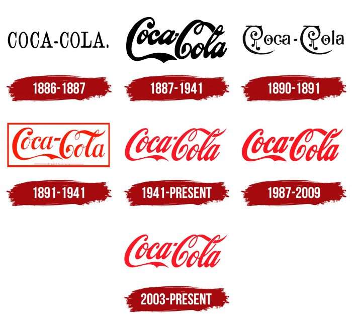
It's kind of easy to pick and choose specific examples, ignore counters, and claim to prove a point. Tiffany & Co, Canali, Rolex, Jimmy Choo, Ferragamo, Prada, Hermes, Bally, Dior, etc. all still have serif fonts (or cursive in Ferragamo's case). And I'm not sure Burberry has changed -- I walked by a store this week and it still had the traditional logo above the door.
Since taste is necessarily personal, here's my personal opinion: 100% of the tech logos look (significantly) better in the right column, and maybe ~50% of the fashion ones (though most are close to indifferent there). The only one that I feel will be dearly missed is the Rimowa one, Balmain also feels less special now. Balenciaga and Burberry weren't an improvement, but neither side looks great there imho.
As a company grows, its branding evolves from the founders managing it themselves to eventually being overseen by an excessively large team of marketers. These marketers need something to do. An obvious project from them to undertake is a "rebrand". The marketers' goal is not creativity or innovation, its safety. So they look around and do whatever everyone else is doing, with maybe a few small adjustments. This guarantees they have something to occupy their time for 6-18 months, justifying their role in the company in case someone asks what they've been up to lately.
What a botched job they did on Yves Saint Laurent logo. Truly amazing.
Weird someone else made the exact same thread on this topic.
https://twitter.com/david_perell/status/1545819896004624384
Same exact image used too.
standing out is not something that established big companies are interested in doing. Generally they’re much more interested in expanding their share of whatever market they’re in than expanding to new markets.
That is much different than being a “new” thing where being unique and different was valued to entice new customers and create/find markets that didn’t previously exist.
The art and branding around corporations will reflect that over time. It’s a small glimpse into what is happening in technology as a whole as it matures and “professionalizes”.
We're in an economic era that mostly selects for safety. What's more safe than a plain sans-serif font? Business owners and C-level execs will believe they won't have to worry that a logo may be turning off a demographic because they think that plain letters will turn away no one or appeal to most.
The day there's a serious economic downturn forcing the losers to close their doors, I would bet the newcomers will have more interesting logos.
As an aside, there's a certain attitude among designer-types on imposing agreed upon "standards" designed to be ultra-inclusive and inoffensive. This is not only a cause for why so many logos have become minimalist, but why so many business websites are using nearly identical illustrations of abstract looking humanoids with atypical skin colors (look up "Alegria" design). It's global-homogenization driven by the politics in vogue.
Related reading:
"Here’s why Alegria is taking over tech world interfaces."
https://eyeondesign.aiga.org/dont-worry-these-gangley-armed-...
"CalArts Style And What You Need to Know About It"
For the same reason that if an open-source project hasn't had any github commits in a fee months, people on HN call it "abandoned". A new logo signals to people that the company is active, their products are being updated and evolved, and they're not stuck in the past. Imagine if a company reverted back to the logo you remember from your childhood. You'd think they were regressing backward also.
Because the scientific arguments for updating the brand are too damn convincing. How else would you improve the gravitational pull in your brand universe?
https://www.goldennumber.net/wp-content/uploads/pepsi-arnell...
Just look at the DNA research they have done (page 12)!
Dimensionalize exponentially.
When you are a young company you want to stand out, you want to have personality. You are disruptive, championing some new way of doing things.
When you are more mature (or at least want to seem like it) you adopt more mature brand language.
No more the volatile, brash youth with risky new ideas. This is a trusted brand, for adults.
Because fashion and what looks good is when everyone does the same thing, but slightly differently.
Desperation to look "fresh," I guess. But often it's a huge failure.
Sony changed its logo in the '80s, I believe, and wisely reversed their decision not long after: https://static.wikia.nocookie.net/logopedia/images/d/de/It%2...

Pioneer, unfortunately, stuck with its shitty redesign: https://i.pinimg.com/originals/2c/6f/64/2c6f64d5649f8b553d7b...

Don't forget it's not just company logos but also product logos within a company. Every Google product is now an indistinguishable rainbow circle.
Back in the 90s, my school teachers said that advertising is a balance between standing out and not being so different you’re just weird.
I wonder if Party Cannon still uses the incongruous logo?: https://www.creativebloq.com/logo-design/death-metal-logo-pa...
Would have been interesting to include Slack as it is just a logo (no typeface) going from a very distinctive logo to a generic one (at first I thought I had a python script running as it is similar to that)
The good news for indie hackers is that temporary logo that is just your name in a san serif font … is probably good enough!
I wonder when Lobster will come back in fashion?
Maybe the Overton window of logo fonts is somehow shrinking, and the brands want to avoid appearing too offbeat.
I remember a phase where a lot of tech companies tried to copy Amazon's smiling arrow into their existing brand's image.
There was a time where DigitalOcean had a little smile line under a cloud on their home page years ago but they've removed it since then.
Of the tech companies, I prefer the new versions of Ebay and Spotify. I think the old ones were a bit much. However I think ebay should have kept the darker blue, the new one looks too similar to Google. Pinterest looks better before.
The rest are about as good as before. But if we go into details. Microsoft's new color choice is too boring, like at least make it a more assertive darker shade of gray. I like the chonky, low-center-of-gravity look of the previous facebook. Airbnb is a bit more legible in the new version. Google went from playful to more rigid. I don't like the t in new Revolut (amusingly, because it goes against the grain).
Edit: Less sure about spotify after thinking some more.
> Brands are more than logos now
> People at the head of these powerful brands know that they are not defined by their logo anymore but by the product or service they provide.
This applies more to the fashion side than the tech side, but I'd like to provide an additional counterpoint here: If I didn't already know about the redesign and just saw these new ones in a store, I'd assume it was some sort of low-quality knockoff.
> "Sans serif invasion" section
It should be noted that many of the old logos were already in some sans-serif font: Revolut, Facebook, Microsoft, Airbnb, Pinterest, eBay, Balenciaga, Yves Saint Laurent, Rimowa.
But yes, as the author notes later:
> switched to a bland and very similar version of a sans serif font
> All the quirks, peculiarities, and idiosyncrasies of both tech and fashion logos were dropped and replaced with a simple sans serif font.
Is it just me or half the examples listed under "Sans Serif Invasion" have even the old logo in a Sans Serif font?
Two words: Focus groups.
Logos end up looking the same, for the same reason (e.g., autos) end up looking the same (i.e., color options).
That said, what gets lost on logos is they are supposed to be an identity, not a badge for joining "the crowd." Instead, unique is abandoned for fashionable and/or trendy.
It is a trend in a trend based space and also for practical reasons—a lot of old logos do not scale particularly well to a tiny profile picture.
I mostly hate this trend, but it is in part a response to the overly playful logos. Look at the trend towards and away from skewmorphism in UX. Very similar here.
Revolut, Facebook, and Pinterest’s new logos look “wrong” to me. The old ones look more natural and recognisable.
The others from the tech group all look like natural evolutions of the logos. But perhaps it’s just that they changed long ago so there’s been plenty of time to get used to the new ones?
I think it's due to human nature: we tend to imitate others to feel we belong to them.
For example in countries where specific "information" or propaganda is repeated over and over, the majority of people tend to comply to that new propaganda.
Even worse is the trend of what I call "lazy logos". Take the name and do a typographical tweak to one letter. Upside-down, different colour, italics, whatever. One slightly different letter and bam! It's a logo. Boooring!
Counter example: Meta’s new logo. It’s an elegant infinity symbol + M + VR goggle shape
Re: fashion.
This is wildly speculative, but it could be that the luxury fashion industry has broadened its consumer base significantly in Asia. And Asian consumers aren’t all that comfortable with cursive or serif fonts?