▲ 186 points
back
166 comments
Christopher Alexander (the architect and design theorist mentioned in the beginning of the article) wrote at length (and depth!) on the concepts underlying the sense of "liveliness" or "life" in spaces, and "quality" in general. He was pretty successful at capturing it too; his "Pattern Language" describes well a lot of the aspects that make spaces and structures coherent vs not.
Whenever I see this stuff discussed, the conversation rarely plumbs the depths. But even in this article -- just look at the photos. The buildings accused of being ornamented -- they're elaborate in a specific way; the complications aren't there just for the sake of adding something, they reiterate certain structural themes, create depth, a sense of connection at variety of scales. Compare to the "unadorned" buildings -- dead, flat, boring, generic, your attention slips off them like water off an oiled pan.
What I often muse about as someone who builds software, are the parallels between the concerns of the architect and those of a UX designer. We've all seen styles and themes come and go, and some comparisons beg to be drawn. The flat design trends of recent years match the anonymous glass facades housing the FAANGs. Skeuomorphic interfaces as degenerate and overburdened as baroque twirls at their peak. Etc etc.
But underlying these comparisons is always the qualification of purpose. The flat and skeuo interfaces fall short precisely because they're decorated (or, undecorated) for style's sake, there's a disconnect from function - even if the function (especially if!) is to make the person faced with them feel a certain way.
Over the many years, the only interfaces I've seen fulfill their mission of connecting with the user, creating a unique space that immerses and engages, are those in games. Finely crafted one-offs, thematic, memorable, full of intricate detail, intimately connected to the subjects of the interaction, the mission, the overall story of the game.
They're coherent, involved, and what communicates that connection are the many details, specific and deliberate. Yes at first glance they're ornamental, but reveal themselves to be deeply functional after a longer look.
> the complications aren't there just for the sake of adding something, they reiterate certain structural themes, create depth, a sense of connection at variety of scales. Compare to the "unadorned" buildings -- dead, flat, boring, generic, your attention slips off them like water off an oiled pan.
Exactly. Consider the very first photograph, which highlights the owls: I couldn't actually see the books, but I could see the owls, and my instant thought was, 'I bet this is a library'. Because owls are so strongly associated with wisdom, Athena, books, and learning. Far from being useless, they are subtly serving as a UI, drawing on a recognition memory: even 30 years from now, should I happen to be walking through Chicago, I will probably recognize the library as a library solely from the owl-book cues.
I'm reminded of Tufte's 'data ink' phrase: Tufte visualizations can often be quite beautiful, but they are not necessarily minimal; they could be made simpler by removing 'ornamentation', but only by also losing subtle 'data' or theme. (You can have plenty of style or decoration, it just has to mean something.)
Whereas, in the anti-human boxes prized by modernism, they are interchangeable, meaningless, big ugly dumb boxes, designed for humans and things to be shuffled in and out of at the convenience of the powers that be - cubicles writ large.
> a sense of connection at variety of scales.
This is the heart of the matter for me. The article talks about how a well-ornamented building reveals more detail as you get closer. I see that kind of fractal richness as the building repaying and thanking the city for giving it the space to exist. It's interesting at every distance, aware of its immensity and respectful of the people who have no choice but to look at it, offering something for the eye of anyone in line of sight.
Glass skyscrapers and unadorned buildings don't have that quality: you get the same cold-shouldered inscrutability whether you're ten feet or ten blocks away. They're fundamentally rude. In the city, but not of it.
Skeuomorphic interfaces educated people to click for the first time on buttons which resembled buttons in real life. Having to click on unadorned words would have been too difficult. Which words are to click, which words are only to read? It still is difficult at times but 30+ years of collective education makes it possible.
Could you recommend any particular readings for Christopher Alexander?
Personally, not a huge fan of the overly-ornamented stuff, but I do think that the current architectural trends are overly... generic. Case in point; Fitzwilton House, in Dublin, a Brutalist office block recently demolished and replaced with a modern one. The original was, well, a lot of people didn't like it, but it was utterly unique. The replacement is a completely generic glass thing, almost indistinguishable from the next one down the canal, or literally thousands of others worldwide.
Before and after shots: https://www.archiseek.com/2016/permission-demolish-fitzwilto...
Pictures don't really do justice to just how startling the thing looked; it was completely unignoreable. Now, from a practical point of view, it probably needed replacing; it was a pretty inefficient use of land, if nothing else. But they could at least have replaced it with something interesting.
(Fun fact: it used to contain the Australian embassy, amongst other things, which always felt vaguely inappropriate; Australia just doesn't have the appropriate sinister vibes for such a building.)
They're the same picture. Someone drew a rectangle in AutoCAD, then did some repeating offsets, handed it to the engineers: "make it work". All I see is rectangles in rectangles ad infinitum.
I think Theatre Royal vs Hawkins House is better example in Dublin:
https://www.dochara.com/the-irish/then-now/hawkins-st-theatr...
Almost seems criminal.
I initially thought the before/after pictures were just two different views of the "before". I was looking for the after.
Both buildings are conceptually very similar. I do like both.
You can tell how ugly a building is by how many trees are obscuring it in photos.
The replacement is definitely boring and generic. Still far less ugly than the brutalist building it replaced. I think this photo gives a better impression of it:
Yeah looking at the pictures I am slightly dissapointed. For comparison, I am looking from my window at this (Slovak National Archive):
https://www.flickr.com/photos/80942841@N08/8352212537/in/pho...
I think the minimalist design trend came from the necessity of making mass production simpler and it still is lauded as “ultra modern” and futuristic because it makes good looking design easier and in turn faster and cheaper. It’s easier to throw away all the furniture and just put 4 white cubes on a white-paited room and call it minimalist interior design than actually choosing different pieces and colors that work together.
The main problem I see is that modern architecture robs cities and countries of their character.
Yet another soulless amalgamation of concrete and glass (that invariably wins prestigious awards and is praised for its uniqueness or something) can be plopped anywhere, Dubai, Stockholm, New York, or Cape Town, and it wouldn't make a shred of difference.
The current trend in Belgium is to build houses like cubes and drap a variation of white plaster on it [1]. While this looks great the first couple of years, the outside gets dirty and not a lot of people pay for it to get cleaned/repainted.
The houses are also always... the same. The variations in it are where the rectangle windows are and the length / width / height. But that is it.
I predict that in 20-30 years these houses will be seen as one of the ugly architectural trends of my time.
While houses that were built a century or even more ago (and that still stand) are lush with these ornaments and still retain a sort of beauty. [2]
I've lived in one of these type of houses and while they have some impracticalities because they have been built in a different century the outside stays a thing of beauty and you could guide people to your house purely because of how it looks.
Currently my wife and I are looking to build a new house and one of the requirements that we have for our architect is to build it with small details on the outside and a bit more classical than the current trend is.
[1] https://sibomat.be/media/f0xf52fy/moderne-bouwstijl-realisat...
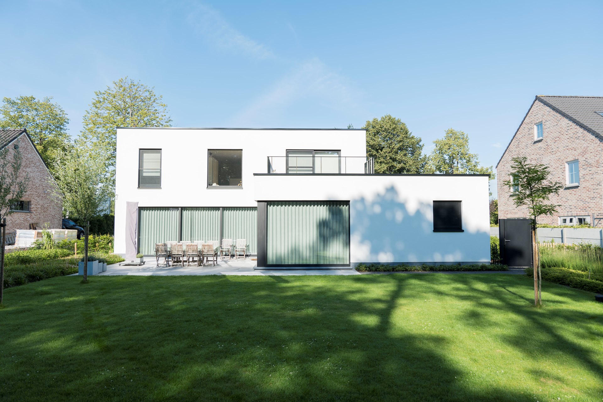
[2] https://en.wikipedia.org/wiki/Oude_Markt#/media/File:Old_mar...

I feel we should bring back Georgian architecture [1]: on the one hand it is quite plain and so it fits well with modern sensibilities (and modern budgets that don't allow for a lot of faff, and the lack of skilled labor), but because of its strong emphasis on symmetry and a modest amount of ornament on doors, windows and railings, it looks vastly better than the lime rendered boxes of today. It also looks great with flat roofs, and flat roofs are here to stay -- why bother with nice roof tiles when you have to cover them with solar panels anyway.
I live in a British Georgian rendered building (think South Kensington London [1]).
I find render is classic and beautiful but yes they are an ongoing maintenance issue to regularly repaint every decade or so and once the render has become damaged, rerendering the whole thing is eye-wateringly expensive. The main challenge is the right materials and expertise (lime render and porous mineral paint) which is expensive so people flipping a house will just bodge it with cement render and waterproof paints that will barely last a decade before it cracks, traps water, causes damp and starts coming way from the wall.
(Note that exposed stone also weathers and requires replacement which can make render/paint maintenance look very cheap).
A key part of the longevity of render is the design of other features e.g. you need correct channelling of water so it doesn't pour from roofs/windows down the render causing stains. This requires true skill and subtle architectural features like drip grooves carved under overhanging coping stones and subtle curves in the render itself (bell cast beading I think?). I am maddened by hokey designs that e.g. add a section of wooden facade above render which grossly stains the render below within months. It's just so careless and predictable. Any staining is a design fault that past experts knew how to avoid. There shouldn't be any "sources of colour" above render.
One of the joys of render is that you can personalise it with your own colours [2] which will stain less easily than white (grey is quite trendy) or even go for full graphic design [3] (I can't recall if those specific buildings were rendered - we have a tradition of drawing stone lines onto render so that it resembles limestone construction).
[1] https://images.mansionglobal.com/im-365825/social
[2] https://offloadmedia.feverup.com/secretbristol.com/wp-conten...

Regarding [1], I cannot understand for the life of me how come people located in places where it rains comparatively a lot (which is the case of Belgium) choose that solution with flat roofs for their individual houses, it doesn't make any utilitarian sense, you're just inviting rain water into your house at one moment or another.
Belgian houses are exceptionally ugly. Very badly proportioned. Belgium has the most beautiful cities in the world, but what that really means is that all the attractive areas predate the 30s. Once outside, it's a shockingly ugly country. Architects cannot seem to balance anything, weirdly positioned windows everywhere (e.g. https://www.a2o-architecten.be/work/vaartkom, this is so typical of all the dreck I saw going up there). Sad to see you use Leuven as an example. When I lived there some decade ago, all new buildings going up were unfathomably ugly. The old core was perfection though.
Kudos to Belgium to preserving its heritage so well, big thumbs down to being a black hole for architecture today.
I like traditional houses very much, but there are two things you to consider: cost and regulations.
When you pay a fortune for the land and building materials you can't really build something nice.
When you have to comply with a million regulations, costs go even higher if you want an individualized house. If you keep it blocky and without decorations you can keep it affordable.
You would never get permission to build the Parthenon because it's simply not energy efficient.
Personally I think you should be able to build your own house without regulations, but not to sell it (i.e. you have to demolish it to sell the land). It's the perfect compromise between safety and freedom.
> I predict that in 20-30 years these houses will be seen as one of the ugly architectural trends of my time.
Isn't that always the case? I seem to recall that all architectural styles have been considered ugly 30-40 years after they were first in fashion. And then eventually they start to become appreciated.
That house looks like modern Australian architecture too.
The house at [1] in the parent post could be a modern house in any country of the world. It just doesn't fit into the history of any of them.
There is a huge gulf for exploration between your [1] and [2]! I dare say good contemporary architects have and will be doing just that.
One thing I've noticed by people watching, both in real life and digitally, is that even if there's a lot of things to do, people won't stick around if the buildings around them are blah and flat. You could have an amazing square with all sorts of little fried food carts and comfortable benches or a digital square with lots of minigames and events, but people won't go there if they're surrounded by modernist and post-modernist architecture comprised of flat glass and concrete surfaces, no matter how planar or curved the overall forms actually are. Such buildings have a "This is a place of function, not humanity" aura that people unconsciously pick up on.
According to Christopher Alexander et al. in A Pattern Language, it's about edges: you want buildings to have a non-zero-width "edge" to them that creates an additional zone that is (a) not the building (b) not the open space beyond it. APL has several nice examples of this.
But this aura is also a lot of social conditioning. People pick up on this aura because people have been taught that ornament is art based architecture and modern designs are function based architecture.
There is an important and very profane aspect of ornament on buildings which isn't mentioned in the article: it hides dirt incredibly well.
Just compare these dirty 19th century facades with a dirty facade of a house from the 70ies:
https://photographierer.de/wp-content/uploads/2015/02/DSC_23...
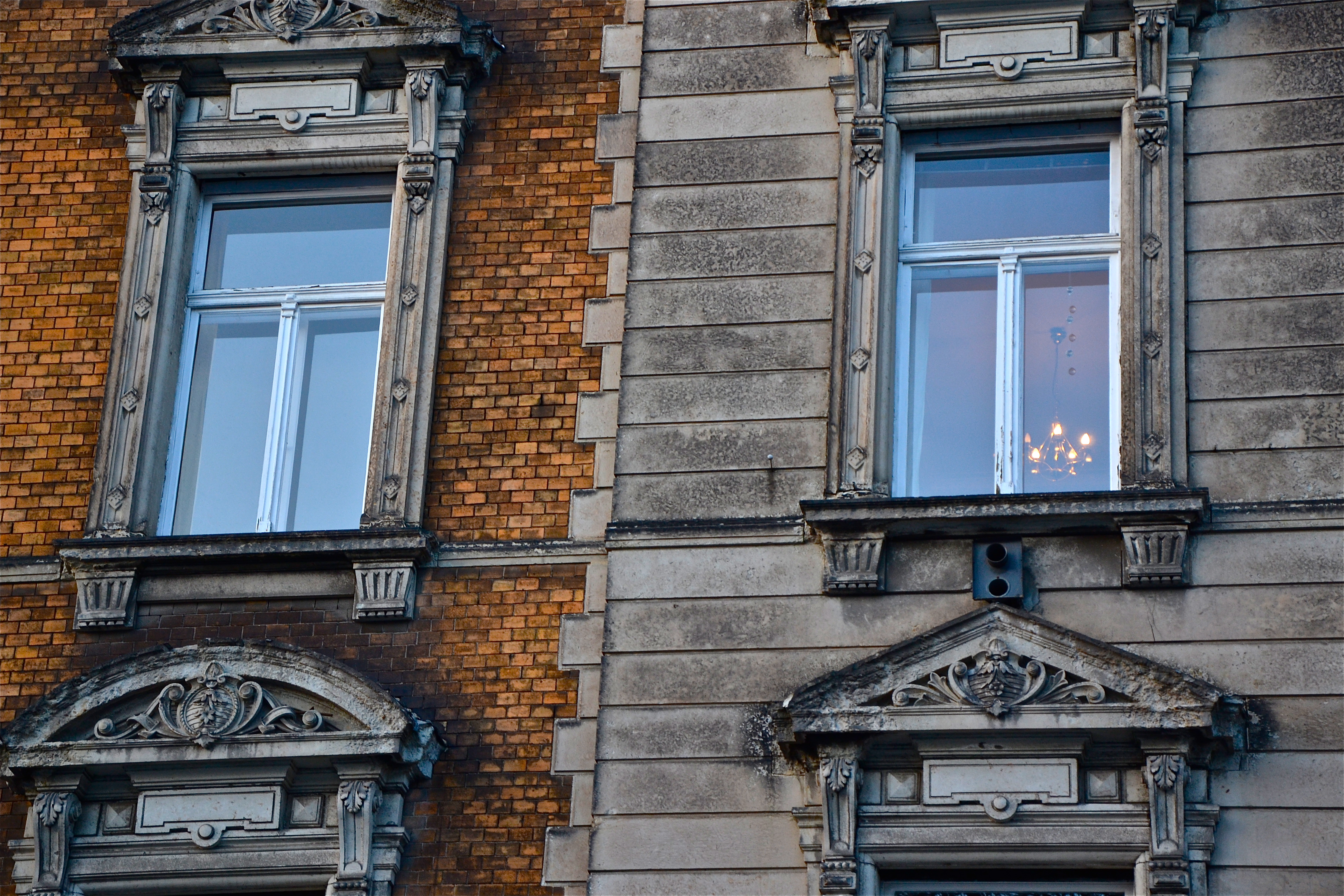
https://schall-fassadenreinigung.de/wp-content/themes/yoothe...

The latter looks absolutely filthy, while the former, although uncleaned for 150 years, still look nice.
I do not buy the efficiency argument given by Adolf Loos at all. What you gain in labor time by removing ornamentation, you will loose in renovation work and (urban) living quality.
I've been preaching this myself for quite a while: the way the aesthetics of minimalistically clean surfaces work is by emphasizing new-ness while they are in fact new. That does look awesome, I'm guilty of enjoying that look myself, but when that new-ness disappears, the same design emphasizes its absence. Ornaments are the the key to graceful aging in architecture.
When you have a clean white wall, with three square windows decisively set in one part, yeah, it looks bold and fresh. But after a few years you get a wall with those rainwater "tear paths" that just look sad because there's nothing else to catch the eye. If instead there were some sills, ledges or maybe just some brick surface patterns, those same water traces would be patina that's perceived as part of the ornament.
But even the Looshaus, the example of an at the time scandalously unornamented building -- on first glance at the picture, seemed to me more comfortable, asthetically pleasing, human-centered, and spirit-raising than most contemporary new construction.
So what's that about?
Is the Looshaus, even though unornamented for the time, still more ornamented than contemporary standard? Or is it about something other than ornamentation? Or is it just my own personal judgement which is unusual or wrong (based only a picture, not being there in person) -- what do people generally think of the Looshaus today?
This reminds me of "Why Beauty Matters", a documentary by Roger Scruton, which fundamentally transformed my views on architecture and beauty in general
To me, Loos' argument comes across as some grand rationalisation for a simple difference in taste. I.e. "I don't like it, but to state my opinion as a fact, I came up with this story about efficiency"
"Why do you waste all that effort (on something that I, personally, don't enjoy or benefit from)?" is an argument I read between the lines all to often …
The headline image (Harold Washington Library, Chicago, 1987) is a good example of how Post Modernism got things badly wrong - with its haphazard ornamentation grabbing styles from all over the time/place and tastelessly agglomerating them together without coherent thesis.
Sadly there are many more such examples, architecture was in a dark place in the 80s.
We moved recently. Our previous house served us well, with adequate space for all the kids. My wife never complained. But this time, as we were getting ready to hunt for a house, she said, "Can our next house be pretty?"
Beauty matters. We can have different definitions of what beauty is, and tastes change. But we still need beauty. We are not just purely functional organisms, whether or not our philosophy admits it. We have a sense of the aesthetic. We don't like ugly, and we don't like boring, and we don't want to be surrounded by either of them.
I've been lucky enough to go to a few folk art museums around the world. Buildings made by peasants can be richly ornamented, a stark contrast to the landscape, or fitting in with it. The designs showcase their craftsmanship, their relationship to their faith, their connection to their culture, and to the natural world. It reminds one of what it means to be a human who cares about more than function. Art and culture may not be the sole domain of humans, but it's one we've mastered. The spaces we live in and around should be filled with it.
People are looking for objectivity in vain. Beyond basic structure, there is no objectivity in art, music, architecture, fashion, etc. That is, you can make the argument that a discordant piano piece is objectively worse than one that follows well-worn progressions, and that would be pretty believable, but saying that a piece with more tremolos than one with no tremolos is objectively better just doesn't work.
Ornamentation is taste, and taste is very cyclical. If you grew up in an over-the-top ornamented place, it's very understandable that you'd view the simple clean lines of modernist architecture as a revelation. OTOH, if you grew up in bland generic International Style places, it's perfectly understandable why you'd yearn for something beyond basic shapes. You can't separate taste from the environment you grew up in, your predisposition for novelty-seeking etc.
FWIW, I think we're near the end of the modernist cycle. A lot of us grew up in very bland environments and now we want something more. But 100 years ago, the same thing we're now decrying was a breath of fresh, calming air in a suffocating environment.
HN would probably be interested in another book by the author, Witold Rybczynski: One Good Turn: A Natural History of the Screwdriver and the Screw (https://www.amazon.com/dp/0684867303). It's born out of a writing prompt for a newspaper article - what is the most important tool (for construction specifically) of the past millennium? Prof. Rybczynski decided on this answer, and gives a history of the screw, both as a fastener and as a way to regulate motion in a machine. It's short but still quite comprehensive, even involving looking for screws in medieval drawings.
Hi, architect here. I'll completely sidestep specific arguments or a criticism of the critic, except one thing. The idea that there's some kind of competition of ideologies inside the entire discipline of architecture is dated.
It would be impossible to summarize the entire "architectural dialog" as one thing, but let's be general. Inside these discussions, a lot of us laugh a people like Patrik Schumacher for constantly trying to make some battle of the -isms happen. Rybczynski has had a long and prolific career, and can be forgiven for being of an older generation who were taught that there was some ideological battle for what was "right" or good or beautiful in "architecture."
But today your typical architect is going to have their own design "style" or method, but also a pluralistic view that it's the diversity of approaches that makes architecture richer. Most architects I know could expound on their love for say Olson Kundig, David Chipperfield, Freddie Mamani, and Kengo Kuma in a single sitting.
I couldn't tell you a single architect who doesn't actively want to make beautiful buildings that elevate the human spirit. Rybczynski only uses the word "developer" once in the entire piece (even then it's just to mention that Wagner was one). In reality, it's the economic logic of modern development that has driven the enshittification of architecture hated by everyone - architects most of all.
Interesting how few windows there are on the bottom of this building, I wonder if it's related to how pedestrian unfriendly streets in the US are?
I used to love ultra modern white-box architecture, but recently I gained a new appreciation for the buildings of my home city in Europe that were built in the late 19th and early 20th century. These buildings are very ornate and I find them beautiful to look at. For example [1] is our old post office. When I look at that I can't help but think, are modern architects even trying?
Ultra modern architecture is still interesting but I like it when it goes beyond a white box and does something unique and striking.
[1] https://offloadmedia.feverup.com/valenciasecreta.com/wp-cont...

Whenever I found myself having to engage with administrative arms of the Massachusetts government, I found myself in Boston's government district with its distinctive brutalist architecture: https://2.bp.blogspot.com/_nbq2z7LV5VM/Sw71CQ9s1dI/AAAAAAAAB...

Which only added to my depression, as I felt like I was on Vogsphere. And then imagine a New England winter wind whipping through those rectilinear slabs. By all means, ornament your buildings. Make your structure an aesthetic.
Ornaments are symbols that encode values. I was surprised they didn't include Venturi's "ducks vs. decorated sheds," assessment of ornamentation. (https://99percentinvisible.org/article/lessons-sin-city-arch...)
The idea is that an unornamented building is just a single (arguably vulgar) symbol intended to represent something else. The example is a building shaped like a rubber duck. A decorated shed is a building with a purpose and then ornamented symbols attached to it to integrate it into its environment.
Wouldn't be nearly as much of a problem if we designed our living spaces with some nature in mind. We plant non-native plants that don't support any bees, butterflies or birds. We don't get to smell the bloom of wildflowers in spring. We don't feel a breeze of cool air as we walk by a forest. Streams are safely redirected under roads so we no longer hear the trickle of water. Our lawns are crafted to be as uniform as possible. We go from one lifeless place to another every day. Of course we are bored!
> Harold Washington Library in Chicago
Hmm, that looks quite like a ripe off of the Central Post & Telegraph Head Office in Denmark.
https://media.homeanddecor.com.sg/public/2020/11/0-VillaCph_...
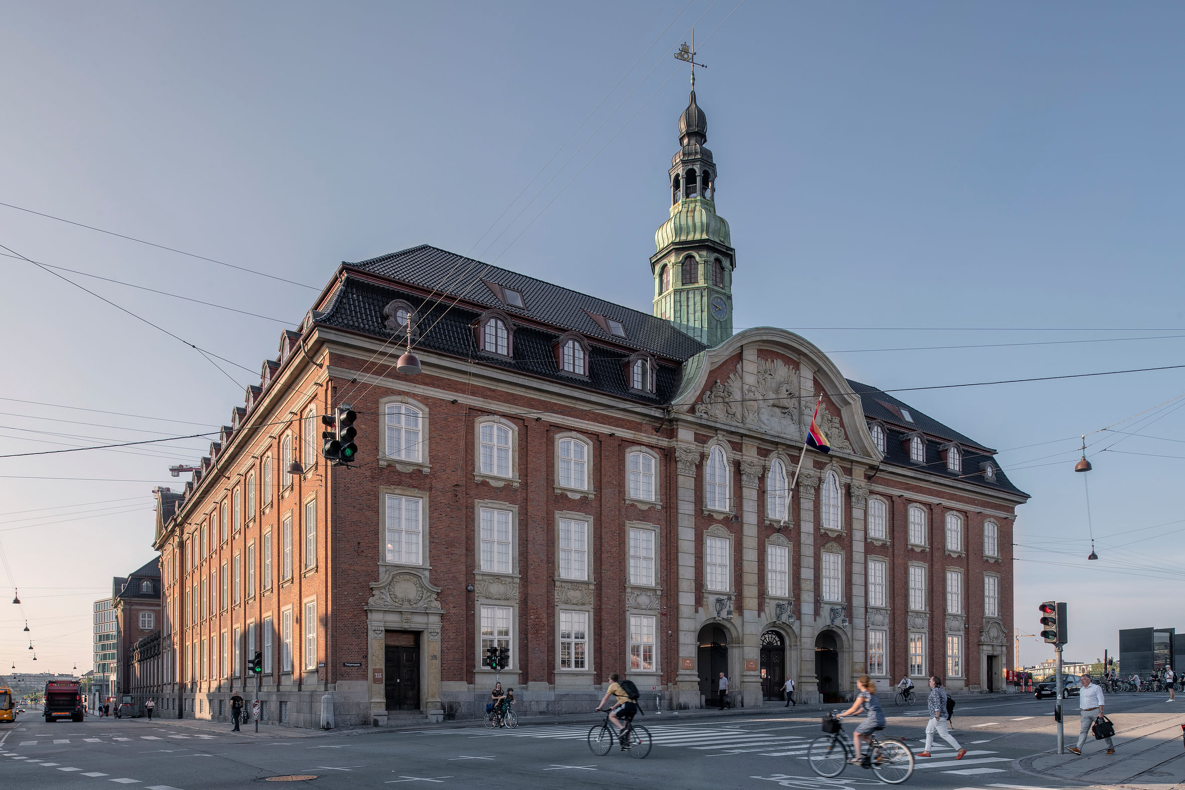
The examples of unornamented buildings in the article are actually highly ornamented, but just more subtly.
In the UK at least, many buildings have zero ornamentation, and are just plain brickwork, without even window ledges etc, and these look terrible to me.
My wife and I purchased a 1920s home for exactly this reason. It's not a magnificent home by any means, but at that time, they seemed to pay more attention to small details. Simple things like the kinds of molding used. The kinds of window frames on the outside. The attention paid to the facade rather than just the function of the home on the inside. The leading on the glass of the builtins (which conveniently also makes it very easy to replace broken pieces). The art deco themes on the door. The stair railings which are both functional, yet artistic at the same time. Not to mention the lighting, which is so far removed from 'Restoration Hardware generic chic' that it almost makes you want to cry to think about the kind of thing we find acceptable today. Everything is subtle but it makes life better to live in something pretty rather than meh.
Howard Roark rolling in his grave
What do building architects think of Ayn Rand's treatise on architecture in the FountainHead?
"The latter presumably referred to the current fashion for tattoos among European royals, including Edward VII, Kaiser Wilhelm II, and Tsar Nicholas II."
Wait...what?!