▲ 58 points
back
22 comments
I didn't read the story (too long), but I really love the site design. It's beautiful and clean without being boring, with great use of typography (of course) and the grid and whitespace. Responsive too, and doesn't hijack your scrolling like so many animated sites do.
Hope they make more pages like that.
Agreed, it‘s great microsite to showcase the font. Another one that I stumbled upon lately is MD IO - a great font and a great minisite as well: https://io.mass-driver.com
Outstanding isn't it. The re-flow when you resize your browser is some of the best responsive design I've ever seen.
For anyone curious about the clock design:
* https://airport.revolvertype.com/img/620px_clock.gif

It seems to be inspired by Swiss rail clocks:
* https://en.wikipedia.org/wiki/Swiss_railway_clock
You can purchase clocks and watches in the style:
What a great font! Very matter-of-fact, but with some stylistic choices that give it just enough character to be interesting. The x-height in the original version is too large for setting body copy, but the variable font comes with an axis for the optical size, which allows tweaking the x-height individually.
If this GIF (https://airport.revolvertype.com/img/typewriter_airports.gif) is supposed to emulate the good old split-flap displays, then it kind of misses the point - on those displays, the letters changed individually, so the font would need to be fixed width (and uppercase).

Not necessarily. Sometimes there are whole words on the flaps. Look at this example: https://stock.adobe.com/uk/images/split-flap-or-just-flap-di...
Even if the airport example is not real, there were whole-word ones at pretty much every train station in Switzerland in the past:https://commons.wikimedia.org/wiki/Category:Split-flap_displ...
Some big stations had per-letter ones.
For the standard design for smaller stations, even terms like "5 minute delay", "10 minute delay" etc. all got their own flap rather than having a separate box for the numbers. This one shows a 6 minute delay on a single flap (pair): https://commons.wikimedia.org/wiki/File:Basel_SBB_EC2_Anzeig...

Wow, so the Swiss have a 1-minute precision even for delays? Germany has this convenient (for the train operator) system:
- 0 - 4m59s -> "no delay" (so it doesn't have to be announced and the train counts as "on time" as far as metrics are concerned)
- 5m - 9m59s -> "5 minutes delay"
- 10m - 14m59s -> "10 minutes delay"
...and so on.
I think it might start at 2 or 3 minutes, but from then on it's in 1 minute increments up to at least 10, and I think even 15 minutes. I believe the maximum on the system is 120 minutes delay, after which (or if it's not sure) it switches to "Unbestimmte Verspaetung" (unknown delay).
You can certainly find a 4min, a 5min, and a 6min on the linked page.
The message "Bitte nicht / einsteigen" (please do not board) always used to be split over two flaps. This caused some humor whenever the first one got stuck, so what was supposed to read "Olten / Basel" ended up as "Bitte nicht / Basel" which roughly reads as "Please don't take me to Basel!", a sentiment that a lot of people in Zurich would agree with.
Actually, I don't think that example is a real one. Adobe has a full view of the same board too (https://stock.adobe.com/uk/images/split-flap-or-just-flap-di...), and at a closer look it seems very strange for an airport board. The flight numbers don't have airline codes, there are no direct flights, and the "vias" don't really make sense for any location I could think of (from Frankfurt via Oslo, from Moscow via Skopje, from Copenhagen via... Khartoum?!). There definitely are split-flap displays with whole words on the flaps, but for airports it doesn't really make sense because there are too many potential destinations.
> and the "vias" don't really make sense for any location I could think of
Most likely because the board has been decommissioned and the flaps got flapped around randomly. Very likely that is why one can't find a picture which shows the board with its surroundings.
> I don't think that example is a real one.
Real as in what sense? Do you think it is CGI?
> but for airports it doesn't really make sense because there are too many potential destinations.
Here is an other one: https://commons.wikimedia.org/wiki/File:Departures_from_ITM-...
.jpg)
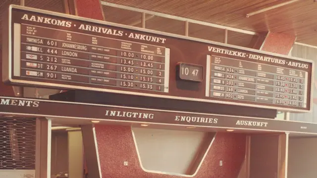
and here is an other one: https://ichef.bbci.co.uk/ace/ws/640/cpsprodpb/16C66/producti...
and here is an other one: https://ichef.bbci.co.uk/ace/standard/976/cpsprodpb/85EE/pro...
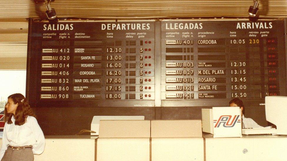
Yes, it is not as common as the per-character deesign, but it certainly was used sometimes.
Ok, I stand corrected - in some cases it makes sense to have whole words on the flaps. The first picture are domestic Japanese flights (limited number of destinations, and it's probably not possible to have all Japanese characters on flaps anyway), the second is Windhoek (Namibia) in the 1960s (also limited number of destinations), and the third seems to be at the counter of a domestic Argentinian airline (https://en.wikipedia.org/wiki/Austral_L%C3%ADneas_A%C3%A9rea...), so just shows their flights. But the "Adobe board" still looks suspicious (mainly because of the missing airline codes in the flight numbers, which all the "real" boards have).
Somewhat relatedly, I hate when graphics people don't realize about variable-width fonts, look at the way the decimal point dances on the time display, because each number is variable width: https://youtu.be/5-w4Ch8dWrg?t=5
And are those supposed to be airport codes or something else? CHI and NYC aren't airports, for example.
CHI and NYC represent the Chicago and NYC FSS (flight service station.) They are IATA codes that represent metropolitan areas.
But would you see them on an airport screen?
Am I the only one who don't understand these desktop (per-user), webfonts (per-view), apps and ebook licensing models?
This is just too convoluted and complicated. What does desktop per-user even mean? Am I allowed to use the font and use it to produce a document if I pay for a 1-5 users license ? or do I have to pay more if that document ends up in the hand of more than 10 users? What if that document end up being a pdf that people might share all over the world? Have I right to use/reference it but not to embed it? What about views? If my blog get 4000 views on a regular basis but a post end up viral and views explode to hundreds of thousands? Am I suddenly in debt with the font creator?
For a start, a webfont is not different from a desktop font. It is a font and that's it.
Just put one single license at 1000usd for the individual one and 4000usd for the pack if you value your font that much for f... sakes.
There's more and more good fonts being made available under the SIL licence - think MIT/BSD licence for fonts (https://openfontlicense.org/open-font-license-official-text/). The selection on google fonts should be good enough for anyone who doesn't want to go as far as hiring a design agency.
It's like the choice between some DRM-based "only works on our brand of device and only when connected to the internet" form of music, or legally acquired MP3s.
I would compare it with LGPL, actually. You can use the font in documents or software with no restrictions, but any modifications to the font itself must be released under SIL (and under a different name).
For the document use case, most document formats do not embed the font, so in that case, you are fine. The license includes an explicit call out for embedding into a pdf: "Embedding of the Font Software is permitted for Portable Document Files (PDF), but only in such a way that the recipient cannot edit or extract the Font Software from the document".
It is not especially clear what that means, but my assumption would be that if you use subset embedding feature when creating the PDF you are fine, as that means even if somebody tries to extract the font, they would typically get a not terribly useful result, as unused glyphs, substitution tables, etc. would have been stripped.
And yes, as a general rule you cannot usually embed or otherwise distribute font files except as permitted by the font license.
On the other hand, at least in the US, you generally can distribute rasterized output of a font, because past court cases have clearly established that typefaces are not subject to copyright, but rather only the computer programs that procedurally generate typefaces from parameters is subject to copyright (e.g. font files). So, it is the vector data and stuff like the hinting mini-programs in the font file which are subject to copyright, not the resulting images it generates. Of course, you must still follow the license for the font software while using it to create a rasterized output.
Font designers are a lot like musicians. They think the revenue of one hit song / font should be enough to retire on.