It looked worse than Windows 3.1 IMO.
back
3 comments
OS/2 looked more modern than Win3.1 because, well, it was newer, but also because of the increased use of "gray 3D slab" style which meant modern at the time (see OSF/Motif).
But the design language was less uniform in OS/2 despite that it was based on Presentation Manager standard like Win3.1. The generous use of colors in OS/2 made it look like a kindergarten scrapbook, rather than a serious desktop OS. Maybe, they thought people would find it friendlier that way, and it might have even looked friendlier.
Yet, Win95 looked way more professional than OS/2 because the design language (fonts, conservative color use in UI elements and more incorporation of gray 3D style in the UI) was simply more elegant. That was mostly because of the influence of NeXTSTEP in the design of Win95 though, so thanks, Steve Jobs, I guess? :)
Not to mention completely innovative paradigms in Win95 like "Start" menu and taskbar which made it to 2024 and became the de-facto standard of desktop UX.
Personally I would choose OS/2 over Win3.1 anytime. OS/2 was more "Mac like", for example, properties and preferences dialogs did not have the Apply/Cancel buttons, you had a Default button to reset to factory settings or you could simply close the dialog for your changes to be applied.
This said, I believe that what made a big difference in look and feel when Windows 95 was released was the introduction of TrueType fonts that had much better rendering. OS/2 was using PostScript fonts, and introduced support for TrueType much later... If I remember correctly thanks to the open source efforts of the FreeType project.
TrueType fonts were already part of Windows 3.1, maybe even 3.0 I don't remember.
> The generous use of colors in OS/2 made it look like a kindergarten scrapbook
Are we still talking about OS/2 2.x? I somehow remember it to be more "somber", and a very quick search seems to confirm that, though it's not conclusive.
https://www.classic-computers.org.nz/blog/images/2009-10-3-o...
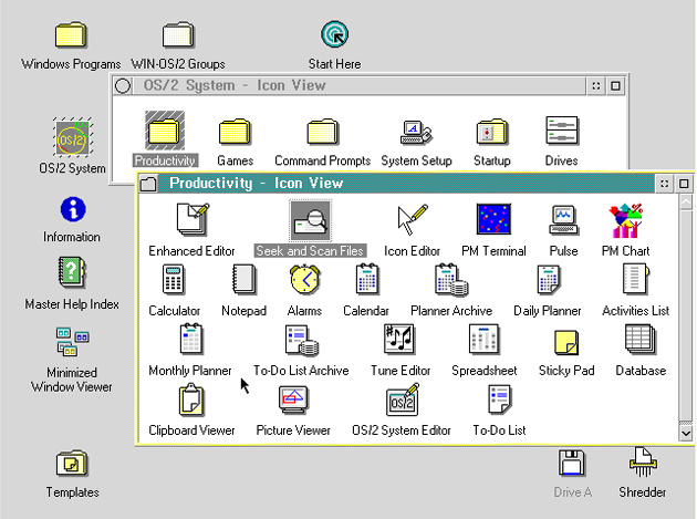
The scheme, yes. But, even on that screenshot, an active window has two separate accent colors (title bar and the frame). Even that’s too much.
Fair, Windows was more subtle there. Maybe in other regards and overall as well, it's hard to do just from memory.
Hmm, tough call. I remember it looking "more professional", in some ways even more logical, but overall I'd say Windows 3 (and yeah, especially 3.1/WfW 3.11) was more "pleasing". That was mostly the color scheme, I think.
Nah, OS/2 was visually better.