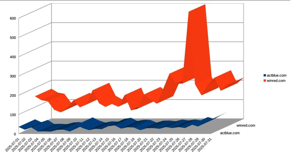
A bit off topic, that 3D line chart [1] makes the data harder to read instead of clearer. A simple 2D line chart would show the trends without the distortion from perspective. The Data Visualisation Catalogue [2] is a good resource with professional examples and design principles that explain why simplicity usually works best.
[1] https://krebsonsecurity.com/wp-content/uploads/2025/09/koli-...