https://guidebookgallery.org/pics/gui/system/managers/filema...
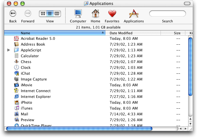
You can make them always on still. I've done so ever since their disappearing act started. It's not even much hidden, it's in the "Appearance" setting pane.
Of course we all make mistakes, but anyone who has made this mistake should really fix it!
Classic Macs were designed for the mouse or trackball. Modern Macs are designed for multitouch scrolling. When it's easy to get the scrolling infrastructure on demand, the desktop might not need the same click-first affordances.
It is configurable, right in System Preferences > General. (Or I guess it's "Settings" now on modern systems, don't know what menu it's in there.)
Just like iOS7+ it is possible to position and layer interface elements in a way where the visual effects will render a screenshot difficult to read, but in practice the elements are frequently in motion or as you've already pointed out easy to make them move. That motion is what negates the layering problems, thus making visual occlusions rare, short-lived and easily resolved.
There is a certain unreasonableness in ignoring that reality, and also ignoring that there is a user setting to keep a full-sized version of the scroll bars always visible.
This isn't to take away from legitimate criticisms such as the issue with the resize hotbox not being updated to match the more rounded corners, but rather highlight that not all online forum criticisms comes from a bona fide place.
That changes the effort required to show useful information from zero to more than zero. Which, while it not be a great quantitative change, is an enormous qualitative change.
Like Chesterton's Fence, it was there for a reason.
"At last (and at least) we have reclaimed that narrow vertical strip of screen real estate on the screens eastern-most vestige! Now to find a good use for it!"
The true annoyance is that in many cases explicitly enabling them does not restore the original functionality.
1. The trivial ability it is to resolve, and
2. The existence of an easily accessible user setting to enable the behaviour that you desire.
Fundamentally your complaint thus comes down to a gripe that the OS's defaults don't match your completely subjective idea of how just one of many OS elements should work.
Which raises such an interesting question, because of all of the UX behaviours present on macOS - this is your hill?
...extra padding?
*They're the same thickness as Aqua.
This is endemic now. Cinnamon does it by default and I hate it. I only managed a partial fix, and then I had to do more work per-app (especially Firefox) to make them behave.
Also, horizontal scrollbars suck. One thing later versions of Finder did well was adjust columns to minimize the presence of them.
We just don't need UI that big anymore. These days our cursors are much more accurate, from the magical Mac trackpad to high DPI optical mice, and we're 40+ years into GUIs so the limited number of people who opt-in to a full computing experience can already be expected to know the basics.
Yes Tahoe sucks, but going back to Aqua or classic MacOS would also suck, just in a different direction. If you actually spend time using classic MacOS and Aqua these days, man is it frustrating to get basic things done. Everything is so slow and you're constantly resizing windows to see whats in them. I own several Macs from the 80s-00s and they are really in need of many quality of life updates that later MacOS revs added. On a modern Mac, enabling 'show scrollbars' gets you to a pretty optimal Finder experience, minus all the stupid Mac bugs and Tahoe nonsense like this article points out.
Scrollbars used to be invisible to me. They only bubbled up to my consciousness when I needed them, and then there was no friction in their use. Now I am having to think about them constantly. To me that is 'standing out'.
I do think that was better overall, and it's something I miss about Snow Leopard, but I can see why they changed it.
This was one of the worst things about MacOS and why they lost me as a user early on. I used to be a Mac Sysadmin for 3 years, and the awful window system (and Finder) made it a living hell. I still don't find much to like about the GUI part of MacOS.
(and yes Lion was garbage, first upgrade I skipped since Tiger, and definitely the first "what the fuck are they doing").
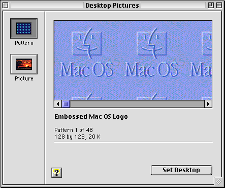
Here's a resizable window in Platinum that has a drag handle but does not have a status bar: https://guidebookgallery.org/pics/gui/settings/appearance/ma...
edit: I missed "Windows" in GP comment. Well let it be known that at least Platinum wasn't like this :)
For this and many other reasons, I just don't think the paradigm would work today. It's philosophically smart but limiting in too many other ways.
Relevant TA: https://web.archive.org/web/20090625152558/http://support.ap...
It was parctical (just like clearly visible scrollbars).
And my conviction is that computers are for practical and not the pretty things primarily. Can be pretty but not on the expense of usability. This last one is increasingly and sadly untrue nowadays!
(P.S. scrollbars aren't even bad)