> But my biggest pet peeve is just the sheer dumbing down of things. iTunes 11 is pretty, but why put everything a click away? What was so bad about a sidebar that makes everything instantly accessible and only takes 80px? Why does the app now prefer to be run in full screen?
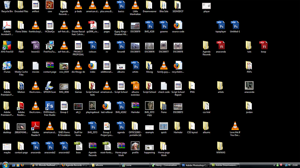
Is "number-of-clicks" really the best metric to measure usability? I can't imagine something like this being considered a good interface, even though everything is one double-click away: http://it.sheridanc.on.ca/images/cluttered-desktop.jpg