▲ 272 points
back
164 comments
Isn't this just the same as population density? I think there's an XKCD about this ...
No— the coasts have substantially higher property values. A cartogram scaled by population is far less dramatically distorted:
http://www.esri.com/news/arcuser/0110/graphics/cartogram_3-l...
The big cities of Texas and the Great Lakes regions barely show up on the property value map.
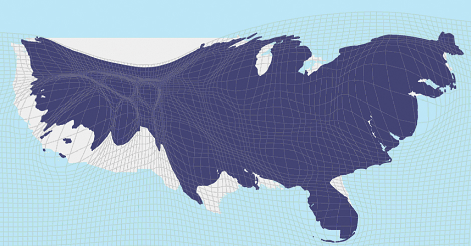
Roughly that's all it's showing. I'd be far more interested in the cartogram of land value/population. I suspect it would do much more to show some of the oddities that I'm sure exist. (i.e. Park City where a lot of people have really expensive vacation homes for skiing and don't live there.)
Not quite fair. Usually the xkcd syndrome is caused by plotting density of something that is intrinsic to people e.g. red hair. You end up with a heatmap of population.
Here, land prices may be higher because more people are there bidding up the prices. But its not a direct property of the individuals. So the heatmap effect is indirect.
Maybe not big point, but there it is.
One of the references http://www.economist.com/blogs/graphicdetail/2015/04/daily-c... has both. There are some differences.
No, unless I'm mistaken, it's literally the sum value of all the bare land, not including the value of the buildings. California seems to have a third of value in the United States, and the Northeast Corridor has another third, but neither have a third of the population.
(edit: I stand corrected, but it's still notable that property value and density aren't necessarily correlated.)
I would be more interested in a weighted map that is controlled by population, which would reveal places where property values are undervalued.
There are more factors that go into land valuation. A few I can think of: mean salary amount, unemployment rate, past and projected economic growth
If you follow the one of the links in the story, you'll see that one of the reasons the housing prices in NYC and SF are so high is the unwillingness of current residents to allow more construction to allow greater housing density. So, in this case, it isn't a proxy for population density since the high prices are actually a symptom of below-optimal population density.
It's related to population density. A lot more people want and try to live in NYC than Birmingham, AL. More people living and desiring to live per same square mileage ~ increased price of property.
This is electoral votes per county, which is close to being population-weighted. What you'll find is that it's more moderate than the land-value cartogram, especially on the West Coast and Florida. Land values trend similarly to population densities, but actually exceed them.
http://www-personal.umich.edu/~mejn/election/2008/countycart...
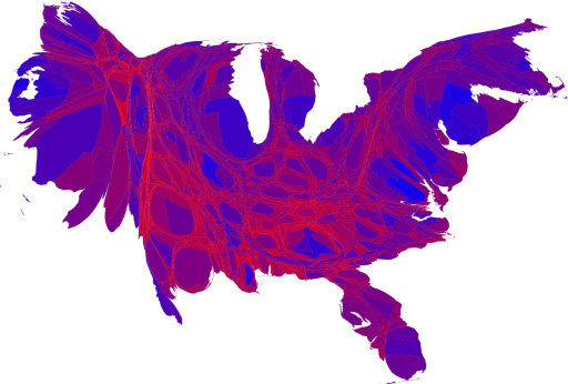
Not quite... If that were so, you'd expect Texas to be visibly bigger than Florida (27M vs. 20M), but their area in the distorted land value map appears to be about the same.
> Isn't this just the same as population density?
Not really, though population density is correlated with high land values, so there are obvious similarities.
No, several of the middle states have fairly large populations ex: Iowa 3+million, but disapear in this map.
PS: This is really a map of wealth * population.
> The demand to live in these places is soaring, but the desire among incumbents to accommodate newcomers is low
Sums up why we ended up in Bend, Oregon rather than Boulder, Colorado. In the latter, there is a small but significant group of people whose idea is that the area needs fewer jobs, not smarter housing.
Edit: http://journal.dedasys.com/2015/06/18/boulder-colorado-vs-be... - more about our choice, for the curious.
As a lifetime Oregonian, I enjoy Bend and get out there a couple times a year. My family even considered moving there a few years ago in search of a place with more sun. But in deciding between Boulder and Bend, we ended up choosing Boulder, well actually Broomfield, but Boulder was the draw, because as you found Boulder housing prices were too high.
Which leads me to the question, did you consider living outside of Boulder to still get most of the things on your checklist, but not face the high housing prices or difficult political climate?
The problem with Bend, as we came to decide, was there is no "outside of Bend", it's an island with not much of any other place to go for jobs, housing, diversity. Add in the fact that the jobs that are there don't support the house prices. With Boulder, you can always fall back to Denver or one of the many suburbs if your independent business or remote job falls through.
We ultimately moved back to the Portland area for other reasons, but would still choose Boulder/Denver over Bend if we had to do it again.
I recommend following Kim-Mai Cutler's Twitter if you want to find interesting articles/takes on SF's housing crisis.
https://twitter.com/kimmaicutler
I especially liked this Vox piece on what actually happens in the process of trying to build more housing in SF:
http://www.vox.com/2015/6/15/8782235/san-francisco-housing-c...
How can the random large splotches be translated into usefulness or meaning? The gif seems to imply that the areas are resized based on their value, that is SUPER not helpful. And the bucket $40b - $1tr?! Almost everything falls in that bucket! I don't think this map is of great value.
It's kind of delightful watching NYC and SF in the gif inflate like gigantic pustules, cysts of real estate.
The fact that people don't all prefer everywhere equally is a "troubling inequality"? Property value is just a reflection of demand vs. supply. People want to live in some areas of the country more than in others, but, since the area is limited, the increased desire drives prices up.
Is it really so shocking that more people would rather live in San Francisco than Alabama?
>Folks who can’t afford to live in those places don’t get to take advantage of those labor markets. The demand to live in these places is soaring, but the desire among incumbents to accommodate newcomers is low. Hence NIMBYism, high housing costs, severe inequality—the whole shebang.
NYC has had a massive residential construction boom (see Williamsburg, downtown Brooklyn, Long Island City, &c). Almost all of the housing that goes up is luxury and seems to do very little to bring down the city's extreme housing costs. Maybe severe inequality is driven by factors other than just NIMBYism? The new condos seem to attract wealthy outsiders.
From the standpoint of at least one "user", I would have gotten a lot more value out of the animation if I could control it (e.g. with a slider). The pulsing back and forth makes it more difficult for me to pinpoint something of interest (e.g. a less expensive city like Detroit) and then track it.
Going down into the rabbit hole, here is a JSON file [1] containing the county level data from the Economist. I think that this is the source of the data used by the author.
[1] http://infographics.economist.com/2015/ASBTest/Land/js/count...
The conclusions from the article seemed a bit rushed. NYC and the Bay Area are pretty different when it comes to NIMBY policies and commutes from low income areas to high income.
A well-known prior art of this idea -- and perhaps not even the first -- is Worldmapper at http://www.worldmapper.org/. "The world as you have never seen before" contains striking world maps with their areas proportional to measures like population (even the population in AD 1), income, aircraft flights, toy exports, nuclear weapons, languages, people killed by floods and 600 more.
i kind of understand why people here frequently against high-density - the way it is done in US ends up with pretty unlivable space of towering boxes surrounded by concrete and asphalt (which is just obvious result of profit maximization while obeying height limits, etc.. While i think having a 200 stories tower surrounded by a park would be better than a bunch of 20-30 stories mid-towers sticking out of concrete/asphalt space)
> "The stubborn unwillingness of incumbent homeowners in highly productive places—namely San Francisco and New York City, which are barely visible on the land-area map, but dominate the housing value map—is a huge drain on the nation’s economy." Are they trying to say that if people didn't have to spend as much on housing then there would be greater GDP?
I'm guessing you generate these by fixing three points along the boundary and then find the conformal map with the prescribed scale ratio at each point. Cool tech. If only this was a useful way to present the information. Color contours work much better.
Talk about big city distortion.
I can't help thinking this trend is at its zenith. Where economic growth is faltering, we're seeing de-urbanization, and I would be long the yellow areas and short the red, because if there is any upset to the JIT way our cities operate (London for example is said to have a mere 4 days worth food in stock), for reasons of climate change or political upheaval or some other reason (no more opportunity in overcrowded cities?), the rural areas on which we still enormously depend for food and water may suddenly revalue upwards.
This appears to be housing value, not property value. So this is leaving off commercial property, which is probably usually proportionate to housing value, and agriculture land, which isn't.
It would be interesting to see areas cross referenced by job creation and relative affordability over time. Perhaps there are counties whose plans did provide growth without economic isolation?
I wonder how things will change once self driving cars become the norm.
Awesome idea! If they could make it less ugly, I would prefer standardizing on this as a way to plot geographic data in certain cases.
Graphing by land area often means spending huge chunks of the map where nothing (relevant to a particular purpose) happens, and cramming all the interesting stuff into a few places on the coasts.
(Note all the hedges and caveats; I don't want to trivialize anyone's home here, but we definitely see this effect a lot.)
While it looks extremely cool, is this really the best way to visualise this data?
Every method of visualisation has its strengths and pitfalls. One of the pitfalls of this method is that it always looks rather dramatic, regardless of the data. Changing the shape of well-known things gives an uneasy feeling, regardless of what you map.
Only data that is perfectly equal will not result in arbitrary distortions. The amount of distortion, magnitude of the local scale factor, is (or should be) a parameter of the visualisation, just like the decision of using a fiery red-yellow colour gradient.
Linked source has a bit more info on what exactly they did. Which is simply substituting area for value in dollars. Only makes sense if the data somewhat follows a normal distribution. And I'm going to guess here, property value does not, at all. It's not even bounded. I'd have picked log value, because an exponential distribution for the value is a much more reasonable assumption.
In case of a visualisation like this, I might actually decide to do something that is generally frowned upon: change the "origin" of the data. That is, add some constant value to the scale factors, to smooth out the severity of the distortions a little. If I were mapping the log value that wouldn't be necessary since it'd be equivalent to scaling dollar values to $1000 or $1M, etc.
I'm trying to remember other examples where data was mapped to local scale in a non-shape preserving way.
The only thing I can come up with was a sort of homunculus visualisation (I forget if it was just a drawing or actually made into a 3d clay statuette). It scaled our body parts roughly proportional to the volume of our brain dedicated to it. So you'd get a giant head with huge bulging eyes, etc. It looked weird, funny, still somewhat human/cartoonish. It showed things as "this is MUCH bigger than that" or "huh I didn't realise my tongue was that important". It wasn't a very clear visualisation, but I'm also hard pressed to come up with a better way to do it.
In other words, this type of visualisation helps to show the data in a mostly qualitative way, not quantitative. And like the homunculus example, the data doesn't need to be super exact (we can't estimate relative area/volume of irregular shapes very well).
But it looks cool.
This situation is exacerbated by government cost of living increases which take location into account. (i.e. New Yorkers get bigger raises)
It is also a consequence of the lack of a quality passenger rail system.
I'd love to see this for Australia, so much of the population is in like 5 cities it would just look like one of those plastic ball molecule model things
How does the transformation work? It must be something that keeps the same borders regardless of what numbers you put in.
Interesting.
BTW, there is a glitch in the animation. One city -- Lincoln, Nebraska, I think -- does not expand smoothly.
Where would one find the source data for property value analysis like this?
It'd be nice to see the values adjusted for household income.
So the US mapped by property value looks like China.. :-)
I don't think I've ever seen a worse Cartogram. At least they did an animation to make it easier to understand, but a regular map with simple choropleth would be a thousand times better.
Supply and demand explain most of phenomenoms..
Why should land values be homogenous?
s/value/price/g