▲ 164 points
back
35 comments
I like the Merriweather font on her blog, very easy to read. This is now my fav serif font. The #444444 color helps too. I suppose she's a book historian - she knows what she's doing in that regard. I wish more bloggers knew the value of not making text completely black on white.
On the topic, what more can be said? She's spot on with "don’t confuse popularity with engagement." It's not just special collections that end up as entertaining "wink wink nudge nudge nudge" content currency, but pretty much anything. Social media eats it, processes it, and spits it out as trivialised "what's new" click-bait. On the flip side, maybe that's exactly what social media users want/expect/enjoy. A sort of intellectual breakfast pic, anything more serious doesn't belong.
What is the reason for not having #000 on #FFF or #FFF on #000? Personally, I find the contrast suboptimal in any other combination.
As someone mentioned, black text on a glowing white LED background is unnatural. Our eyes are not subjected to that anywhere else in life.
"Eye strain" might be overly dramatic, but certainly fatigue will happen earlier in bright contrasty reading conditions. Designers often want pure white backgrounds though, they love their white backgrounds! So the only improvement possible is to increase the text from #000 to something like #222. This does not mean the text won't look black anymore, it simply takes the edge off but still looks black. Obviously the lady's blog she wanted grey so she went with #444.
Ideally though pure white background should be avoided if there's pages and pages of text to read. "Paper white" is what e-readers aim for. Thank God the Kindle app for tablets allows background colours to be reduced. I like the "newspaper white" tone, with a touch of sepia thrown in. Perfect!
#FFF text on #000 background is the worst. Many designers I've worked with over the years agree. Paragraphs of text will "shimmer" due to the extreme contrast. If there's a lot of text on the page, never have it #fff on #000. Bring the white down a notch and/or the black up a notch. It will still look like white on black but just look softer and better.
>Ideally though pure white background should be avoided
I can buy into eye fatigue from the background being mostly arctic white (#FFFFFF) such as a fullscreen Notepad text editor. This can be especially annoying when one has a 31" monitor -- it's like having a giant 31" lightbulb shining into one's eyes.
However, I still don't see any evidence that the text color of #000000 causes eye strain.
HN'rs... try this:
  go to "sarahwerner.net"  (the webpage of this thread)
  In Google Chrome press F12 for Inspector
  Right-click on one of the grey paragraphs and select "Inspect element"
  In the "Styles" tab, press "+" to add a new css rule
  The new rule is "p { color : black; }"
  In Chrome, it lets you use your mouse to click a checkbox to dynamically toggle that rule
  You should also see that the values properties pane to toggle from "rgb(68,68,68)" to "rgb(0,0,0)"
(Here's an animated gif showing what the F12 experiment looks like: http://i.imgur.com/mmfKIjW.gif

Keep in mind that GIF demo is 8-bit color not 24-bit so you must do the experiment yourself to get an accurate comparison.)
Experiment with toggling back & forth and see if you suffer the "eye strain" when it flips to #000000 that some folks are talking about.
Personally, I think #000000 looks more readable because even though the sarahwerner.net's background is #FFFFFF (pure white), it doesn't "feel" like pure white because she has large elements on webpage such as photos and screenshots. My guess is that the eye "averages" out the entire background to be a "light grey" even though the underlying RGB value is pure white.
You might be right about #000 on white not causing eye strain any more than grey on white.
The grey font on sarahwener.net is more pleasing (to me) because I associate eye fatigue with overly contrasty page environments. Looking again, it really is the Merriweather font I like most about the text. The lighter grey colour is less to do with it.
White text on black on the other hand as I mentioned, it causes shimmering. It's hard to speed-read. Harsh white text on pure black will challenge your eyes after a few pages. I've been on the receiving end of user complaints about this very thing. We changed it to off white text and brought the black up slightly and everyone agreed it looked better.
As you say, bright white screens are lightbulbs shining in our eyes. Personally, it's the white backgrounds that hurt my eyes both on large monitors and reading web pages at night on my tablet. I even have a greasemonkey script that "fixes" this on some regular sites I visit such as Google. I don't touch my monitor brightness because I need it to be accurate for photoshop etc.
It's amazing at what lengths people go with the theoretical arguments and personal conjecture.
Screens don't really have any black - the black you see is just a dark gray. The screens have limitations ...
Even if you'd have a very good screen, very few people go through the trouble of calibrating their monitors.
At the same time, no one can point to a scientific study of contrast choices over many types of screens and (mis)calibrations ...
PS. Screens are calibrated to ambient light - that compensates for the white being too white kind of problems.
Contrast tends to be a balance. #000 on #FFF (or vice-versa) rarely ever occurs in nature. It also tends to strain eyes. Optimal contrast for most people tends to involve a dark grey, as seen on her website.
The easiest design trick to make a website more reader friendly is to move a black font to a grey font. (Obviously there are exceptions and personal preference involved, such as yours)
>#000 on #FFF (or vice-versa) rarely ever occurs in nature. It also tends to strain eyes. Optimal contrast for most people tends to involve a dark grey,
Is there actual scientific research that supports this?
Most printed books have dark black ink instead of grey ink. (Although the paper of the pages may not be #FFF white but an off white.)
In the office, the laser printers lay down dark black toner on crisp white paper. The paper brightness can be ISO 98 or even ISO 102 and the black toner is extremely comfortable to read.
If your statement was true, I would think there would be a massive demand for dark grey toner printed on light grey paper because it is "less strain on the eyes."
The evolution of Amazon Kindles are also moving towards better contrast. Early models were dark grey e-ink on light grey background. The latest models are getting closer to the ideal of black text on white background and the customer reviews support that improvement.
A comparison datapoint: Using F12 inspector, I notice that sarahwerner.net paragraphs uses rgb(68,68,68) while HN posts' text use rgb(0,0,0). I think most of would find HN text to be more comfortable to read.
Is there actual scientific research that supports this?
I don't know about OP, but in painting and in video/film art pure black and white are encouraged to be avoided. There they are called superblack and superwhite. In paintings it's because there is rarely (or not at all) such color in nature and in video (same for painting) also because it used to degrade signal for some reason in analogue era (strong yellow was avoided as well).
Paper doesn't shine into your eyes.
We also try to avoid staring into the sun, for the same reason.
What objectively measurable difference is there between reflected and transmitted light?
Polarization might be different, but that's something that's only barely perceptible to humans. I don't think it's plausible that it could affect legibility or eye strain. ( https://en.wikipedia.org/wiki/Haidinger%27s_brush )
Energy transfer.
There's a big difference between absorbing reflected ambient light and having photons pumped into your retina.
If the display shines into your eyes, you've mistuned it. Displays white should be as bright as paper sheet you're holding next to it. Fix the settings now. It'll be good for you. Low contrast displays and screens are bad. That's why contrast optimization is so important, like on Kindle. Every new model got higher contrast than previous ones.
But HN has a shaded background, which still reduces the contrast.
If the non-white background is an offsetting factor, why isn't the fact that #000 is actually realized on LCD/LED monitors as "dark grey" also an offsetting factor to reduce contrast?
Apparently, it looks like there's a difference of opinions (rather than scientific rigor) whether the "dark grey" of #000 is "light enough".
I'm fine with it ultimately boiling down to subjective aesthetics but sgk284's post made it sound like #000 eyestrain was scientific fact.
White paper doesn't have glare, unlike some monitors.
If my screen is too bright, I'll turn it down. I'd strongly prefer that designers not try to make the decision for me, when there is no possible way they can have more information about my reading environment than I do.
I agree with you, but her website is hard to read for some people.
If people are going to tweak contrast they should have dark text on an off-white background, rather than strog white background and mid-grey text.
There’s no display with infinite contrast. #000 and #FFF are some sort of gray on any display. If you lower the display brightness to save battery life, high contrast is the only thing that works OK.
The font is very thin on Windows Chrome (which sounds like a broken record, because this has always been the case). If you intend to use that font for a general audience, make the colour darker or bump up the font weight.
I bemoan the disaster that is happening with the BBC archive of radio and TV (about 1,000,000 hours of content!) - they didn't manage to place it online completely, thus, it is not shared, commented upon, put in collections, and integrated into this living fabric that is the social media.
In the meantime cat videos, art videos and all sorts oddities flood youtube, FB and reddit, and get the lion share of attention.
That's a little different - isn't the problem there that the copyright for each individual programme is unclear and may not be wholly owned by the BBC? As a result, it is difficult and time consuming to track down the owner of each programme to secure the online archival permissions.
With the book collections in the original article, copyright is very clear. Their books are out of copyright and the collections own the photographs that they took of them. So, they are able to make them freely available if they choose to.
First - archival should be the ultimate fair use. Because the explicit deal of copyright is - temporary monopoly vs public domain after its expiry, any attempt to prevent or not aid archiving is equal to directly depraving the public of what it is owned in the future.
Archival is not the (legal) problem. Making the archive publicly accessible for consumption is. (and note that most countries' version of "fair use" doesn't cover as much as the US one)
A lot of the archive is online - see http://genome.ch.bbc.co.uk/search/0/20?adv=1&media=playable&...
The problem there is that the various rights encumbrances are a near-insuperable barrier. Not just copyright, but the rights of the performers. Everything is designed to work right with television broadcast.
At least they're keeping it now. We lost many hours of stuff because they just recorded over the tape.
Google cache mirror: http://webcache.googleusercontent.com/search?q=cache:TDYdhcB...
Good talk. I enjoyed the fact that she put up both a voice recording and a text version with images. I listened and followed along.
OK, for those who went tl;dr: http://sarahwerner.net/blog/wp-content/uploads/2015/07/Slide...
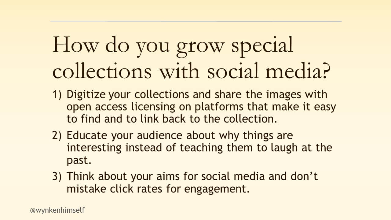
As a nonspecialist, I find only her first point compelling. Anything no longer under copyright is public domain. And for the rest there's fair use. I suppose that owners could seek to recover digitalization cost. But wouldn't Google be happy to help?
"fair use" is a difficult topic, especially internationally. An explicit license (or being honest and declaring things as public domain when they are) makes it way easier to use content.
Note: "library" here refers to actual libraries with books, not the programming kind, and "collections" as in "museum collection".
And here's the Wikipedia article on "Special collections", for anyone else unfamiliar with the term: https://en.wikipedia.org/wiki/Special_collections
(scrollsdrollscrolscroll)
What a horrible website. Control your images.